VENDI APP
eCommerce / Design Systems / Identity
Role: UX, UI, Research, Wireframes, Mockups, Visual Systems
I was tasked to design an overview of an experience for a client who wanted the funciontality for people at a music festival or large-scaled event could order food or drinks from a vendor anywhere inside the grounds.
Strategy and UX
Kicking off this project, I set out to establish high-level framework for how the app would generally work. I started with three main objectives:
1. How can one quickly find the closest relevant vendors on event grounds, this would need to be accompanied with visual mapping as users would most likely be unfamiliar with location.
2. How will the product effectively communicate availability of food types and drink options with as little scrolling or interaction as possible.
3. How will one can easily enter orders with a streamlined checkout process, know where to go when ready, and follow progress.
2. How will the product effectively communicate availability of food types and drink options with as little scrolling or interaction as possible.
3. How will one can easily enter orders with a streamlined checkout process, know where to go when ready, and follow progress.
All of these objectives were the crux of the project, and were clearly defined in working sessions with the key stakeholders. After various rounds of level-setting and feedback, I then was in charge of creating a simple, digestible discovery and research map that would allow us all to understand who was likely using this app, how they would proceed through its funnels and ultimately succeed in making purchases quickly and easily.
Familiar Apps specializing in Ordering and Location Tracking
These apps have easy ordering functionality within the food and beverage delivery industry.
These apps have exceptional tracking and location abilities.
Strategy and UX
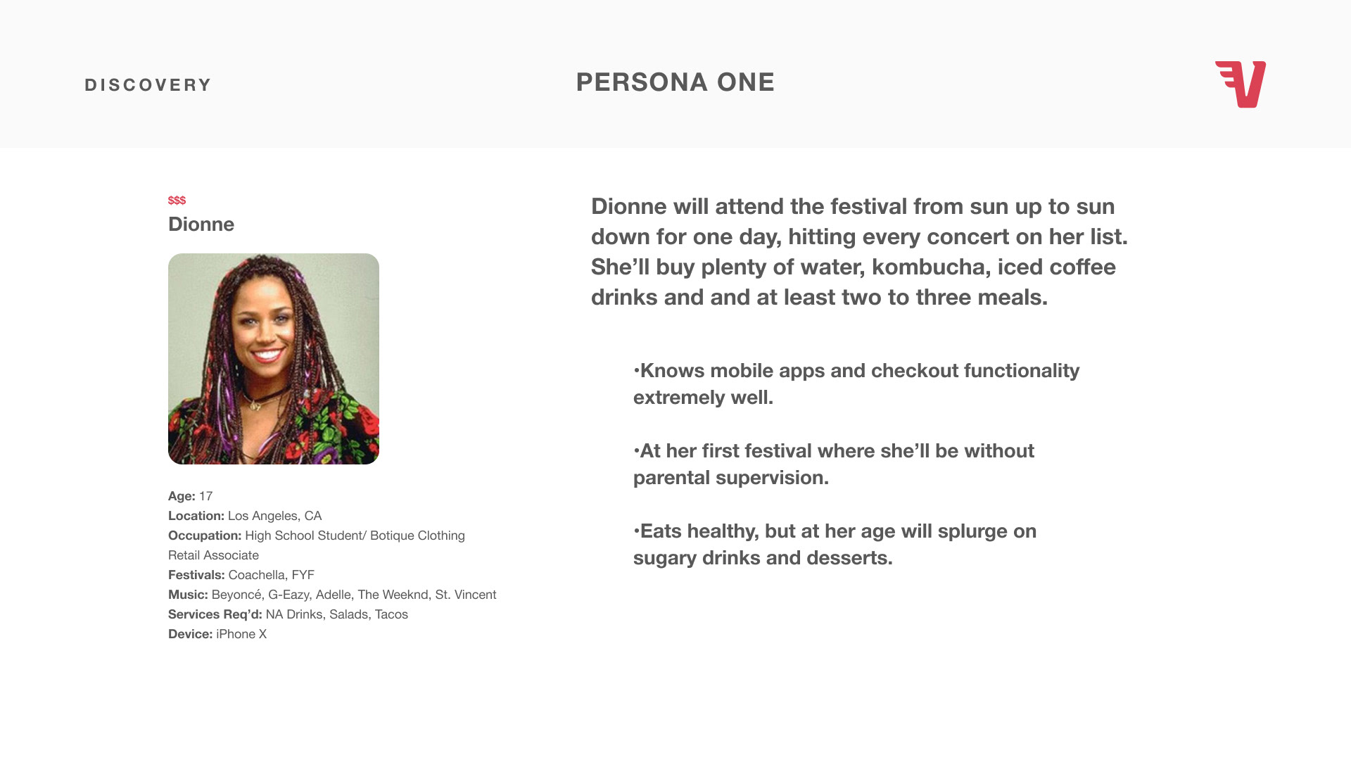
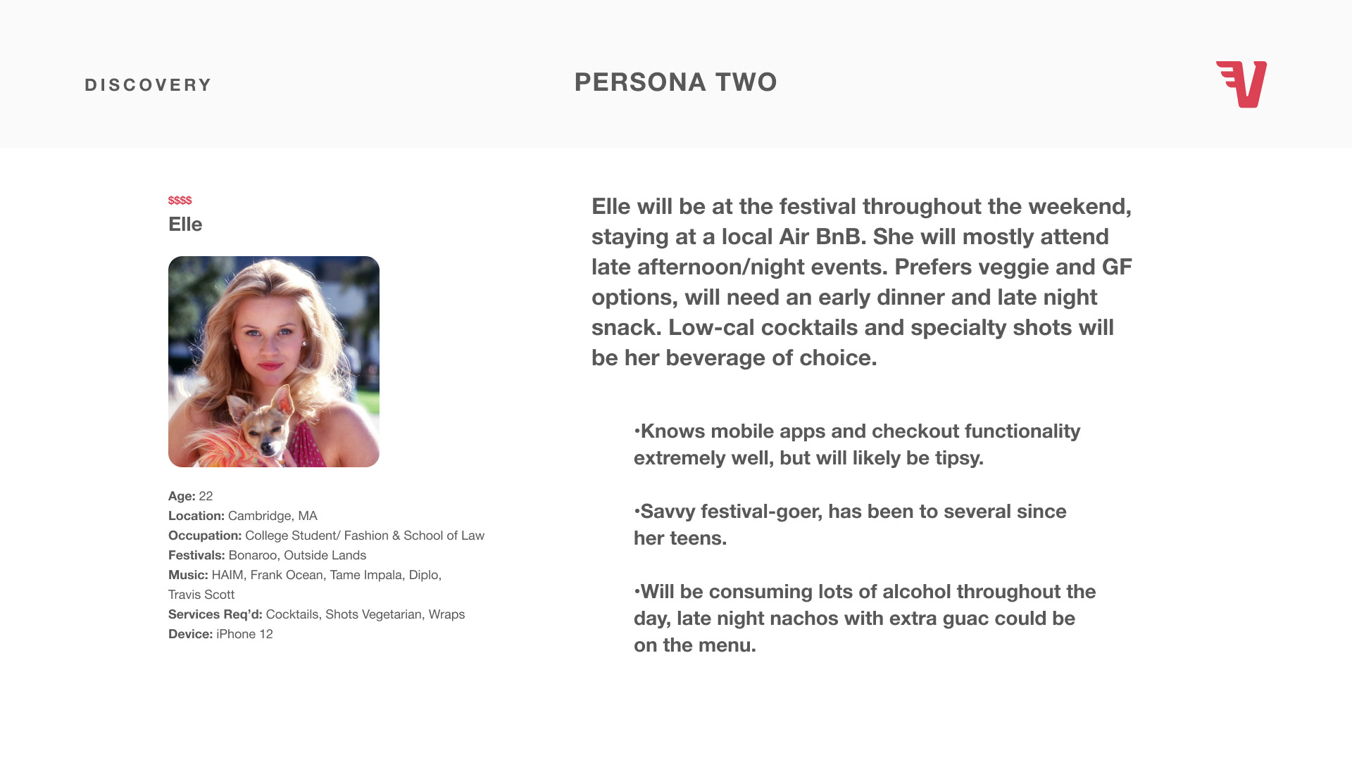
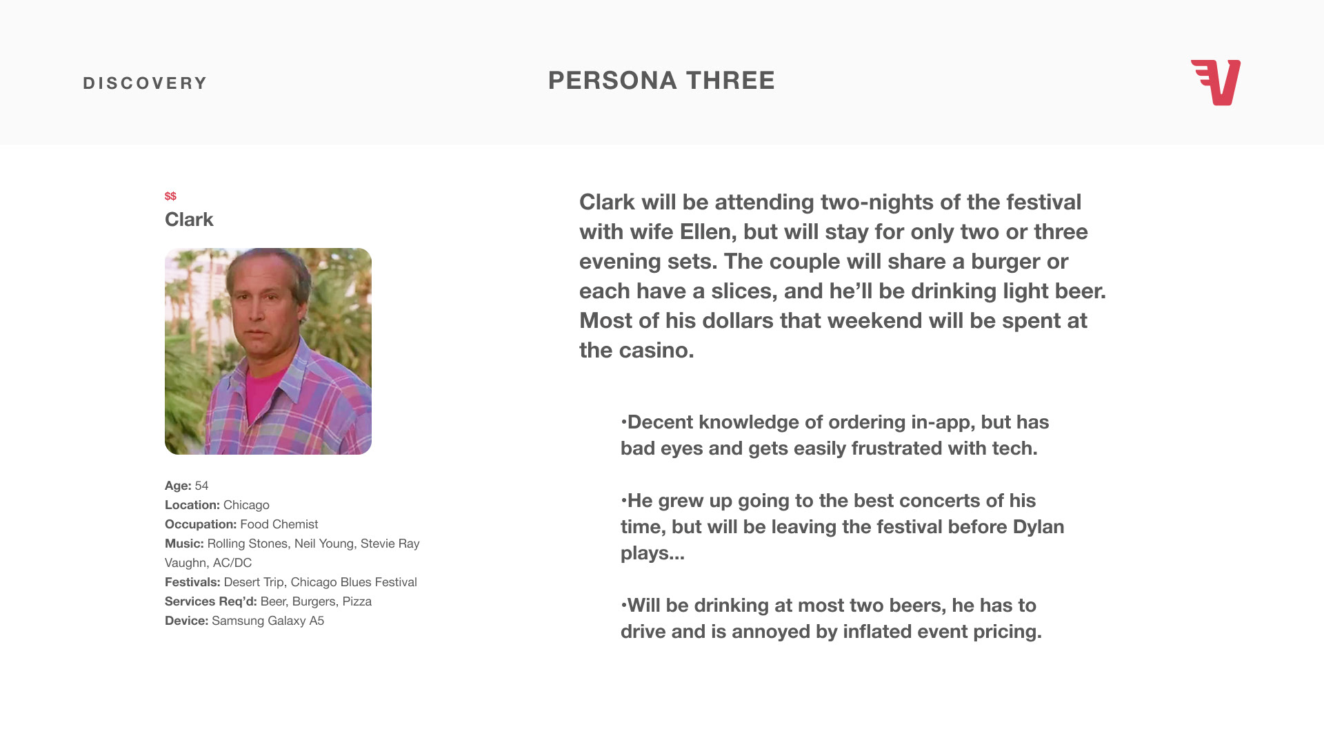
An important component of the initial research was defining user personas. There are certainly all types of individuals that would potentially attend a music festival and similar events, but working with the client helped us gain a basic understanding of who could typically be expected.
Next, a bird’s-eye user flow was developed to help the client and dev team understand how one would move through the experience. Getting this developed early on was important for Project Managers to understand the order in which stages of the development should be fleshed out.
The tracking and location functions would take a significant amount of development and testing in order to work properly, as this was one of the most important aspects of making this experience seamless.
The search function would also need to be exceptionally robust, showing results from many different potential keywords, from specific food/beverages, categories, and vendor names.
After reviewing this journey, we’d dig in on some of the more complex processes, and then be able to start wireframing screens and start organizing how content would appear.
Wireframes
Once we settled our general UX guidelines, the initial visual exploration began. I put together sampling of some of high visibility screens, this helped us to understand the basic structures we could expect to see throughout the application. From there would could make more detailed decisions about design and visual system traits.
Introduction
1. Logo/load screen.
2. Intro screen, where user can sign in or start sign-up process.
3. Single-page sign up process, starting with 3rd party account sign-in options, or traditional email and basic info form. After sign-in, location confirmation screen is triggered (not shown).
1. Logo/load screen.
2. Intro screen, where user can sign in or start sign-up process.
3. Single-page sign up process, starting with 3rd party account sign-in options, or traditional email and basic info form. After sign-in, location confirmation screen is triggered (not shown).
Home/
Quick Filters
1. Sticky header with navigation and location picker. Shrinks on scroll (not shown).
1a. Location lightbox with option to change and preview map.
2. High and lower level filter selections with preview list below.
Quick Filters
1. Sticky header with navigation and location picker. Shrinks on scroll (not shown).
1a. Location lightbox with option to change and preview map.
2. High and lower level filter selections with preview list below.
3. Sticky bottom navigation for quick access to VIP screens.
Menu/ Item Info
1. Vendor’s information, including rating, current order wait time, and location.
2. Menu with quick filters by category.
1. Vendor’s information, including rating, current order wait time, and location.
2. Menu with quick filters by category.
3. Sticky bottom navigation for quick access to VIP screens.
4. Menu item information, with required and upsell options, and quantity (not shown).
5. Add to cart CTA appears after required selections are made, this will trigger quick view of items in order + checkout CTA (not shown).
Checkout/ Track
1. Final order information, with preview map showing user where to pick-up, and updated wait time.
2. Toggle order between ASAP or schedule for later pickup.
1. Final order information, with preview map showing user where to pick-up, and updated wait time.
2. Toggle order between ASAP or schedule for later pickup.
3. Order item summary, with options to update quantity, remove items or go back to add items from menu.
4. Order item summary, with options to update quantity, remove items or go back to add items from menu.
5. Order tracking graphic, with real-time updates.
It was important to understand how to most effectively communicate a lot of information into a restricted space, an issue most all application design faces. I pulled inspiration from some familiar aspects of well-designed and iconic institutions that could be related to the Vendi app.
Massimo Vignelli’s design system made for New York’s subway maps and signage is one of the all time great accomplishments in design, it has helped millions of people day in and day out navigate a complicated transit system. It does this with no discrimination to age, language or disability. I used his look and feel when choosing fonts, styling icons, and determining layouts.
I also wanted to subtly incorporate what is a familiar theme of a “dark” or “dive” bar atmosphere. A lot of music lovers have spent time in these local establishments enjoying performances, and getting drinks and food through often hectic environments. I drew on classic red velvet features that are often associated with these places when determining how I’d use color.
Lastly, I believe any digital experience can draw from the timelessness of a well-designed printed page. I personally love the way this is done through art catalogues, books that contain vivid images with clear and concise captions and information. Strong food/beverage photography can stand on its own as a selling device, so organizing additional information for usability should carefully used and done so minimally if possible.
UI Elements
With a nice grasp on the foundation of our product, it was time to produce the true look and feel. Beginning with the logo, font and color palette, I assembled what would be a more definitive example of the application.
The Logo
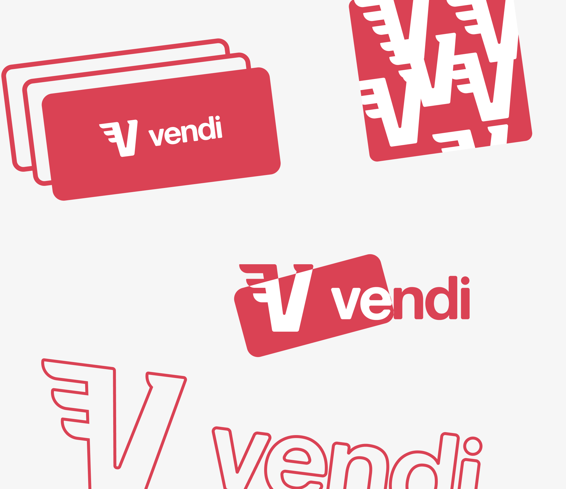
When developing the logo, I wanted a clean and modern design that would feel comfortable for users familiar with similar competitor apps, but didn’t want to go with just a wordmark.
When developing the logo, I wanted a clean and modern design that would feel comfortable for users familiar with similar competitor apps, but didn’t want to go with just a wordmark.
I developed an icon that resembles a Solo® plastic drink cup, added the suggested motion with the wing, and paired with a custom font to match the softer edges.
When shrunk to standard iOS button size, I created a general ~1/3 spacing guideline for legibility.
Typography
Helvetica Neue was chosen mainly due to its pure reliability. Titles, body copy, and everything in between, they didn’t make a movie about it because of its failure.
Helvetica Neue was chosen mainly due to its pure reliability. Titles, body copy, and everything in between, they didn’t make a movie about it because of its failure.
I did however leave the option open for the client to pivot and choose an alternative. It would have been a modern alternative that’s based on Helvetica of course.
Color
Black ink on white paper is popular for a reason, I stick with what works.
Black ink on white paper is popular for a reason, I stick with what works.
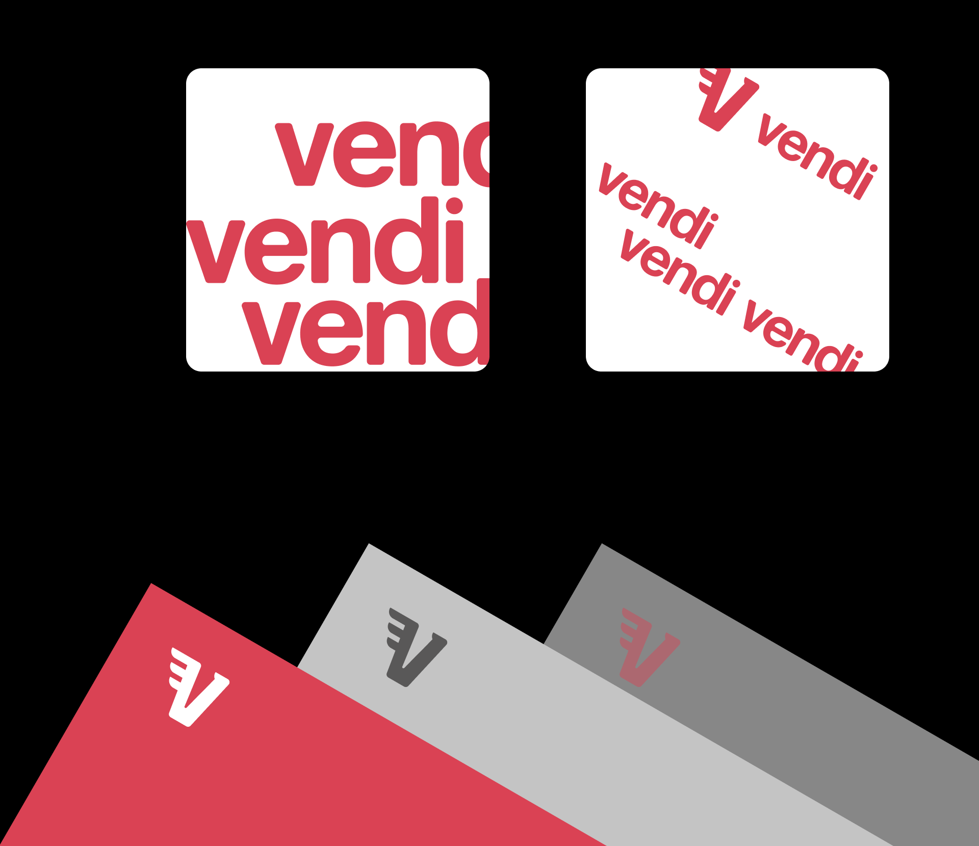
To add some separation, we are also able to pick from a variety of grays, and the brand spot color in a limited capacity.
Hi-Fi Mockup Examples
These were designed to a representation of how content can be easy to read at a glance, with minimal spot color used for button toggles, CTAs and critical order information.
I kept the background as mostly white with subtle gray contrasting blocks for an easy transition to trending dark-mode settings on phones.
I kept the background as mostly white with subtle gray contrasting blocks for an easy transition to trending dark-mode settings on phones.
The next step of this hi-fi exercise will be generating animation effects when activating buttons, scroll, and other interactions.

