BRIXTON.COM
Visual Systems / Identity / eCommerce
Role: Art Direction, Design, Marketing Strategy
Team: Marketing Team, eCommerce Team, BVA
The dreaded replatform... After years of issues with our previous CMS, we finally took the plunge to rebuild on a new platform, along with incorporating an all new brand design and identity we had just recently completed.
A mighty task considering all the elements of design that were to be updated, rearranged, and in a lot of cases built from the ground up. With the help of our agency partners we were able to create a product that increases sales, decreases load time, looks amazing and will scale for growth. It was up to me to keep everything visually in-sync and on-brand while relying on our partners at BVA to establish move over the data and backend.
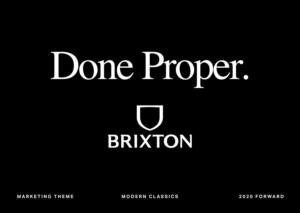
Done Proper Campaign
Variations on a Theme
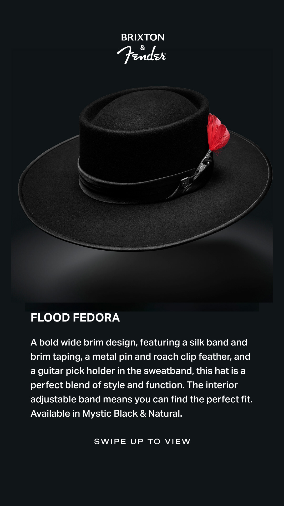
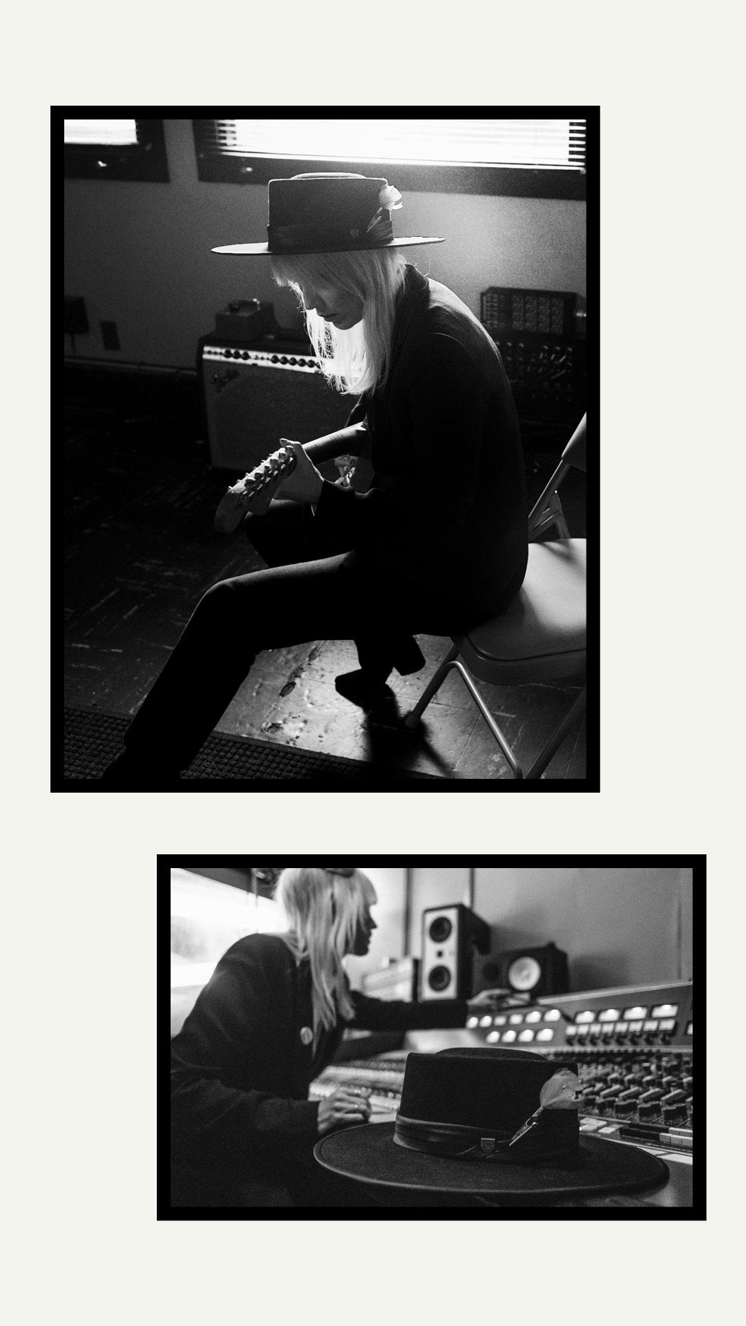
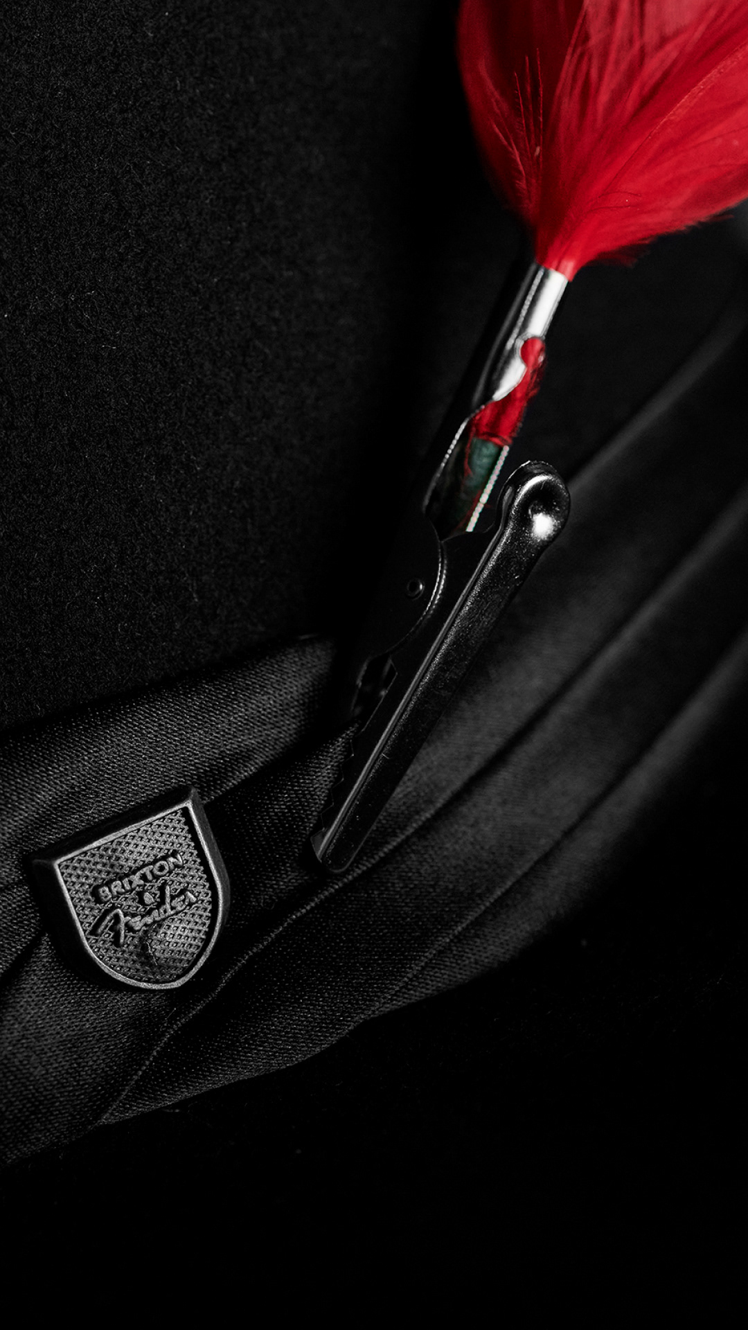
A new brand campaign we had named “Done Proper” had been developed into our overall branding and visual system during the previous quarter. For the beginning stages we partnered with our friends at Basic who helped give us the foundation for what would become the central theme of our new consumer facing brand identity.
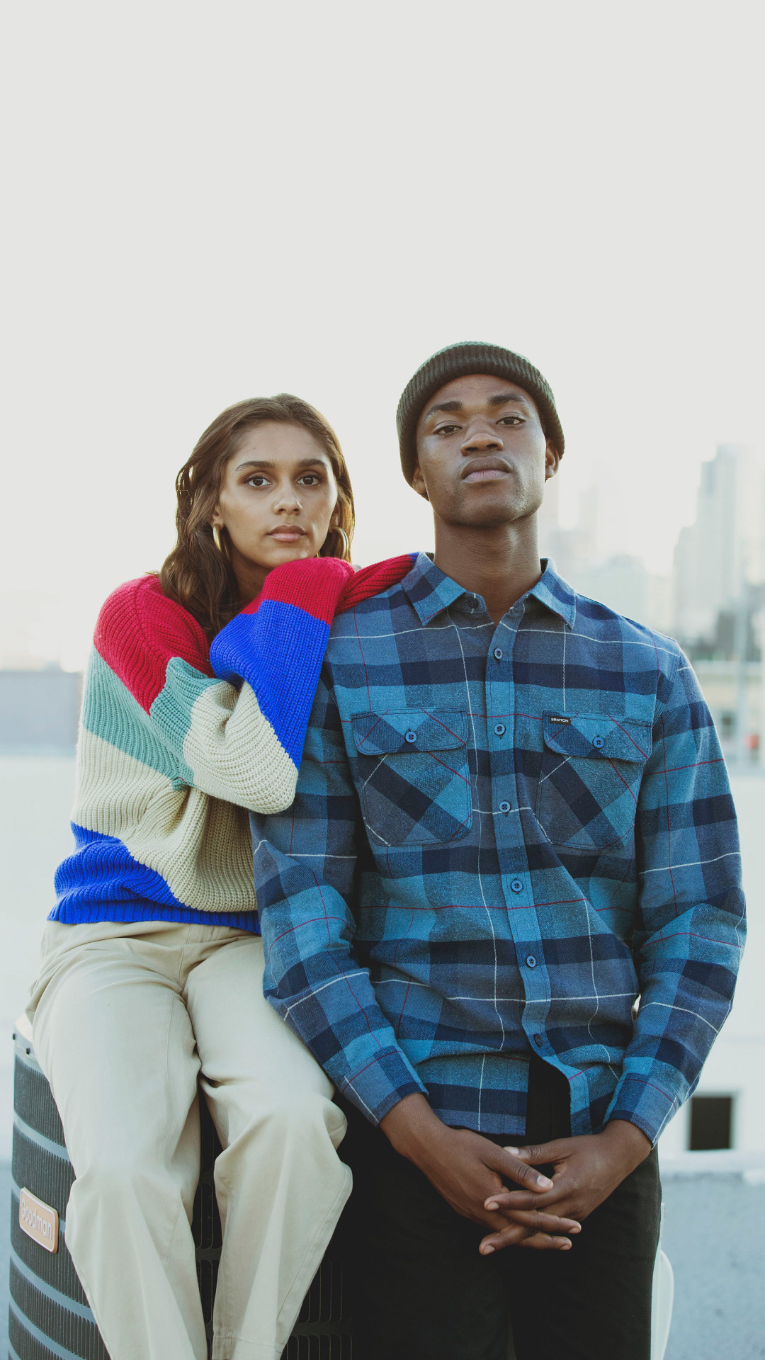
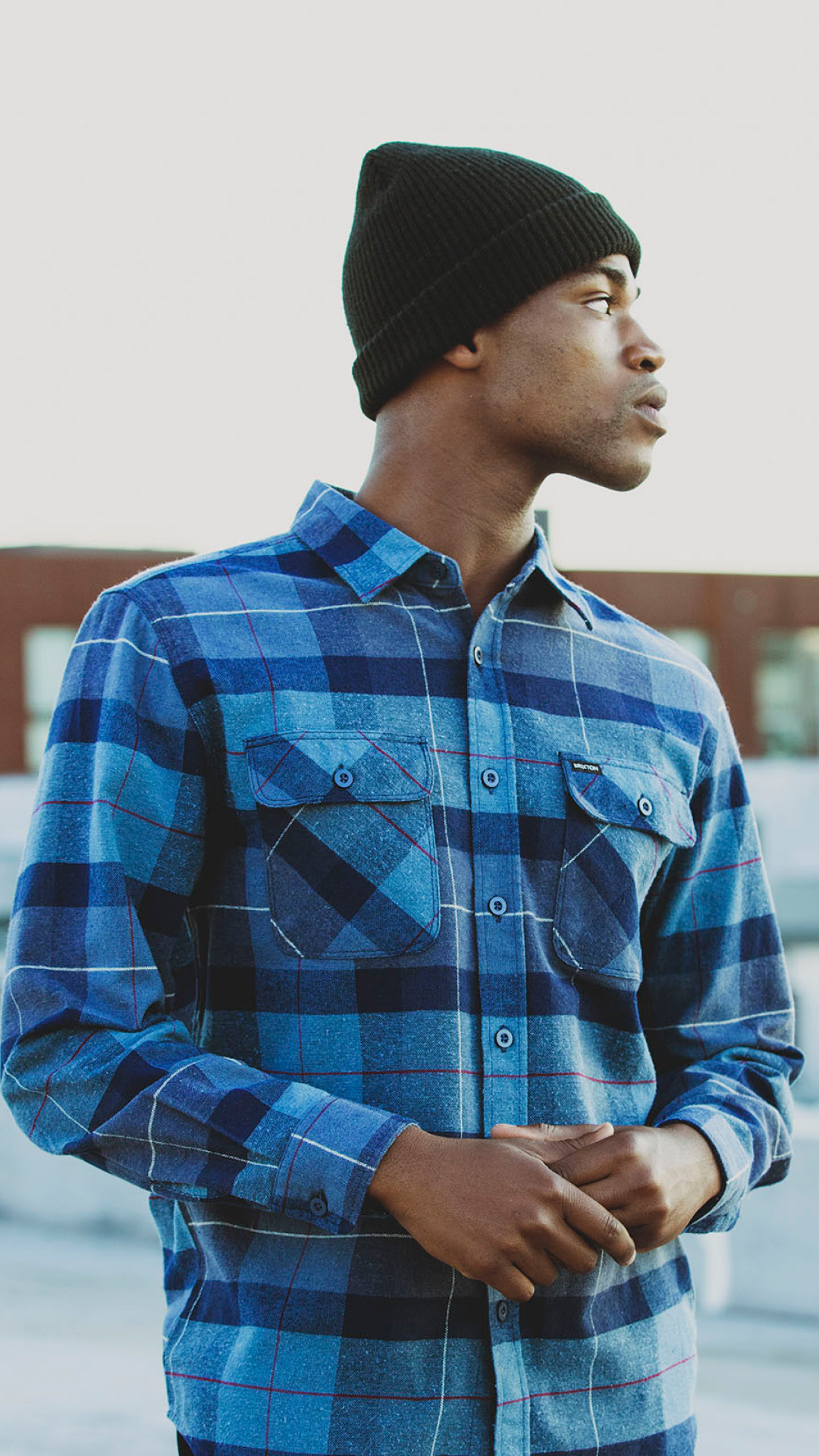
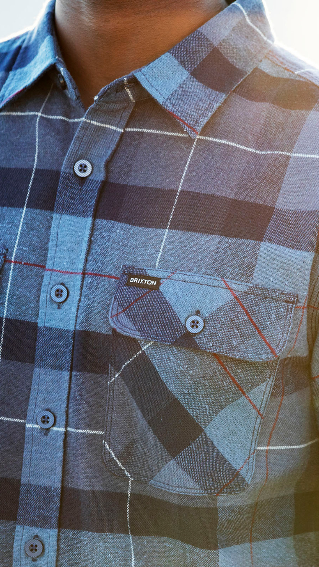
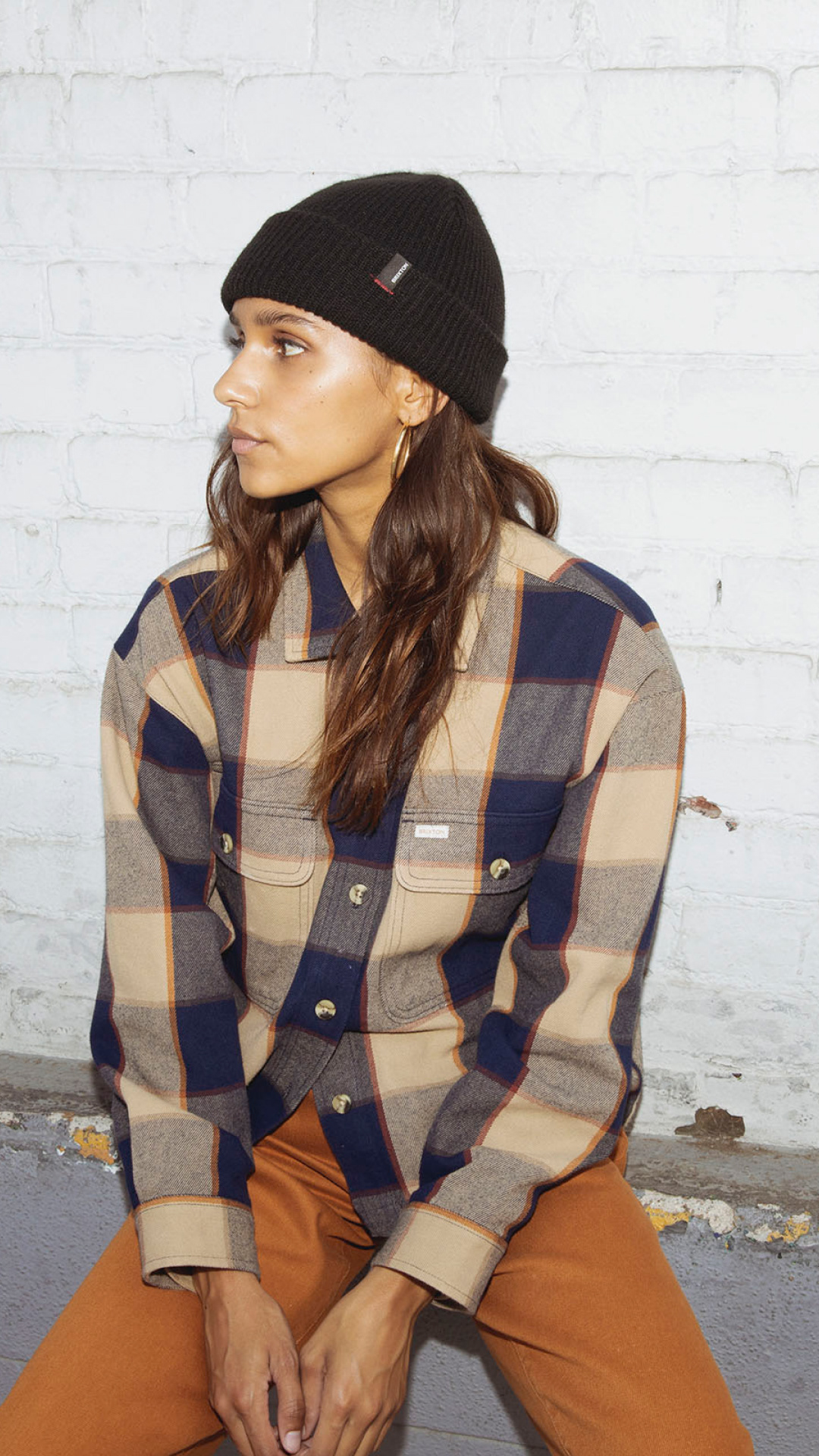
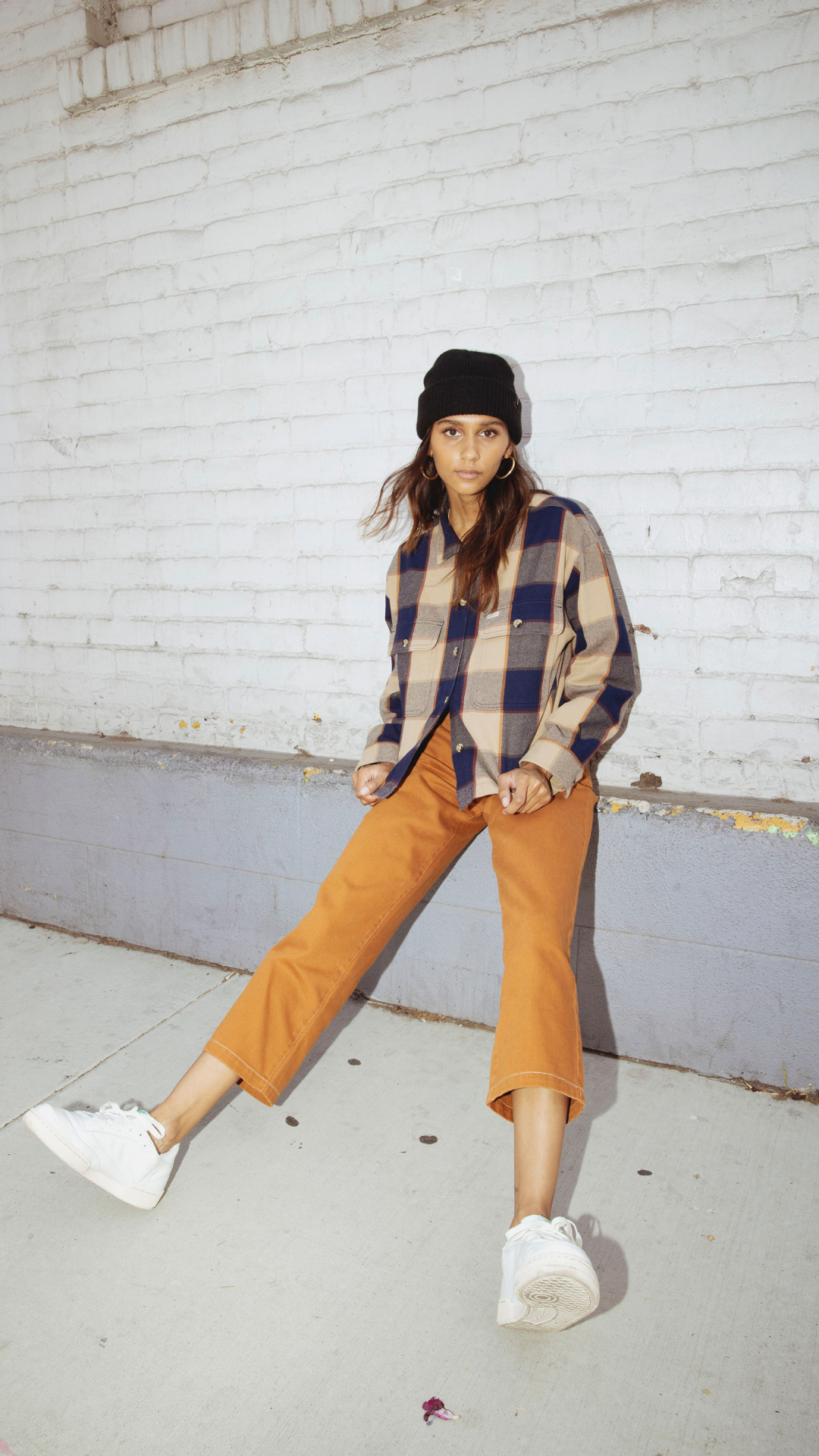
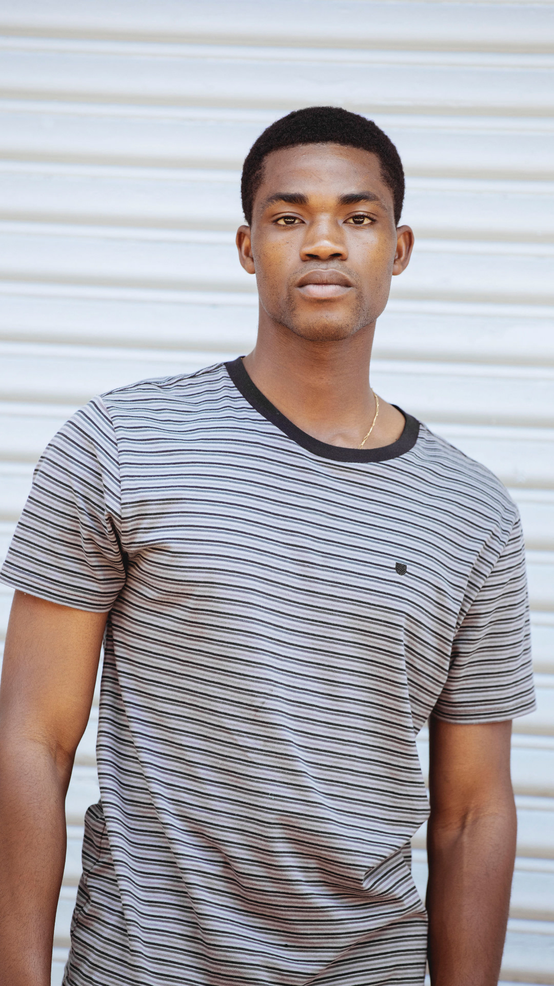
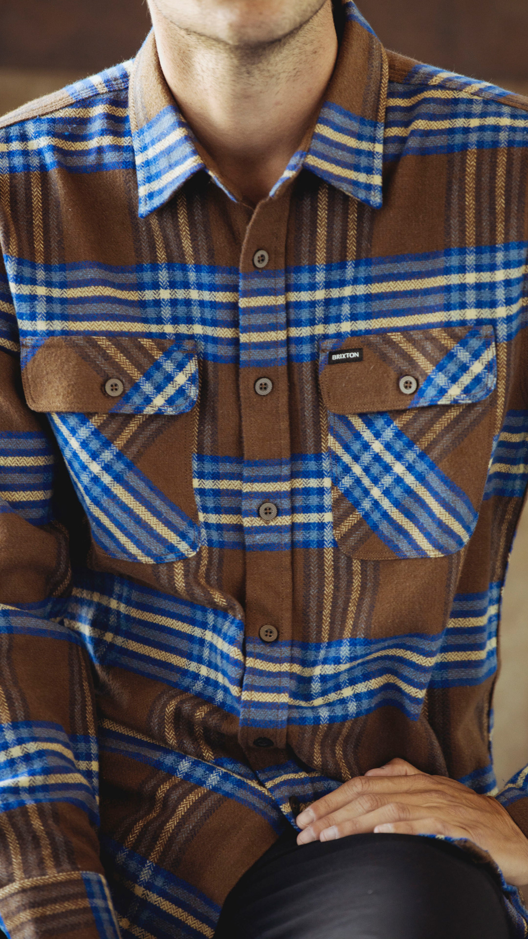
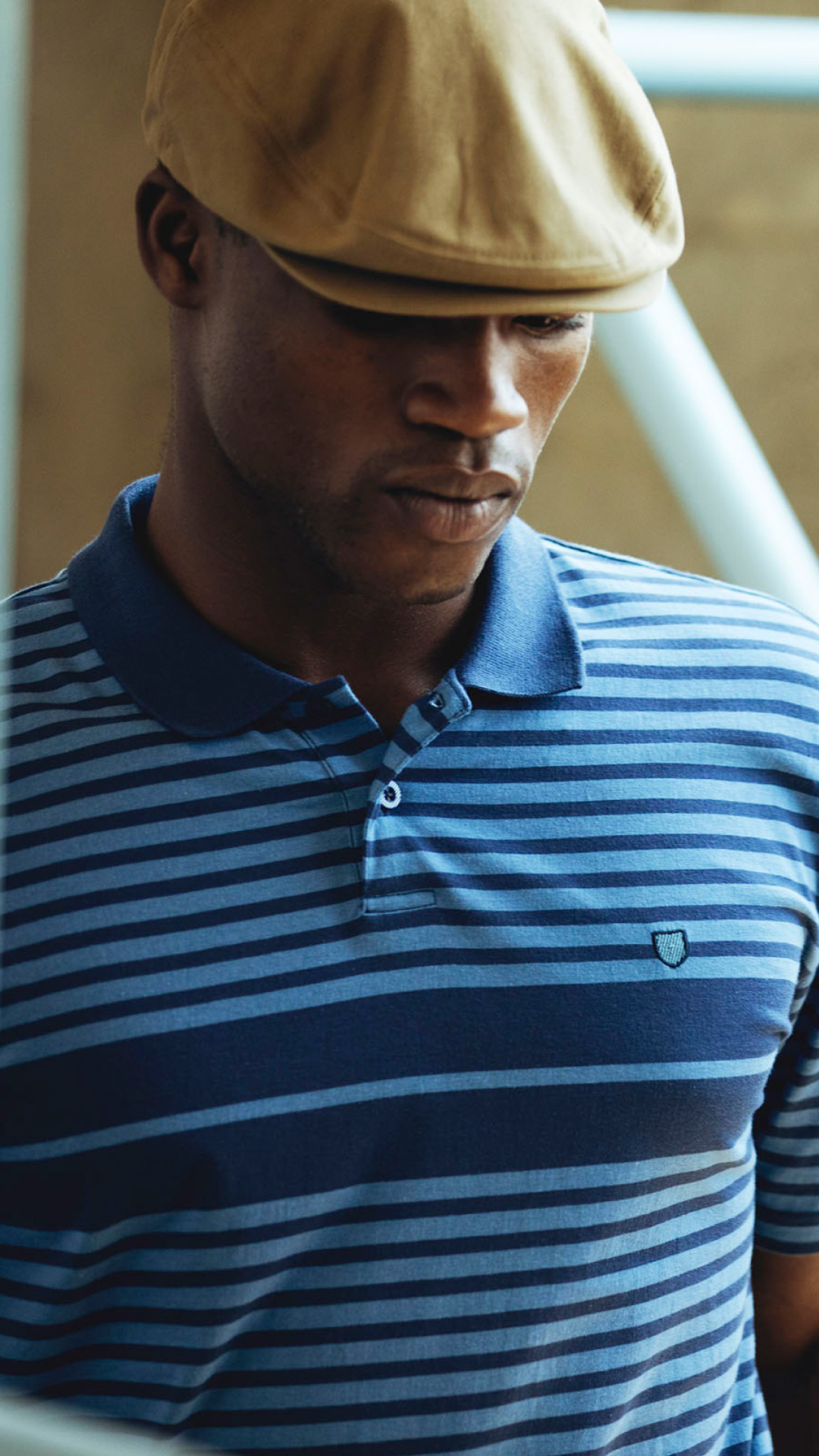
Brixton already had a strong brand history with years of rich photography and design, so I knew with the right ingredients we could build on the strength of our heritage, and create something fresh and meaningful that works across print and digital.
DESIGN DIRECTION
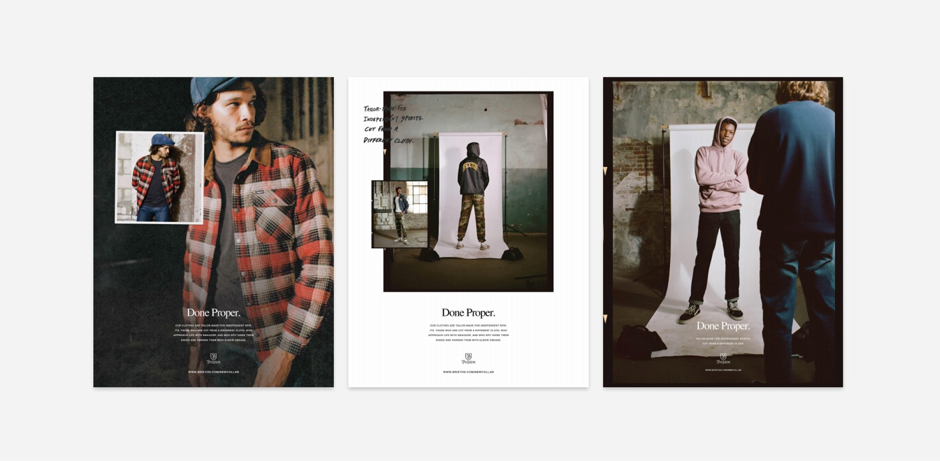
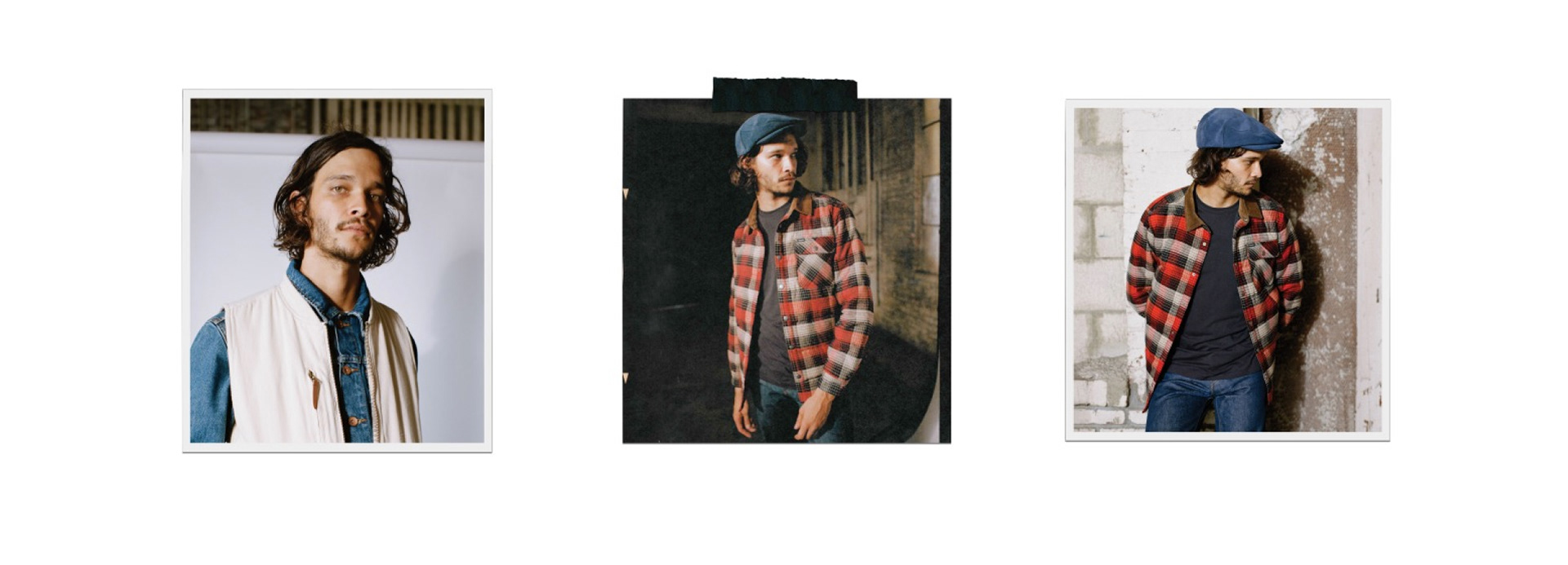
We started with a system that relied on a lot of layering and collage elements, including cutouts, and handwriting interspersed with typed messaging, which gave the campaign a true “grass roots” and “American grit” feel, but also a strong fashion sensibility when paired with the elevated photography and products.
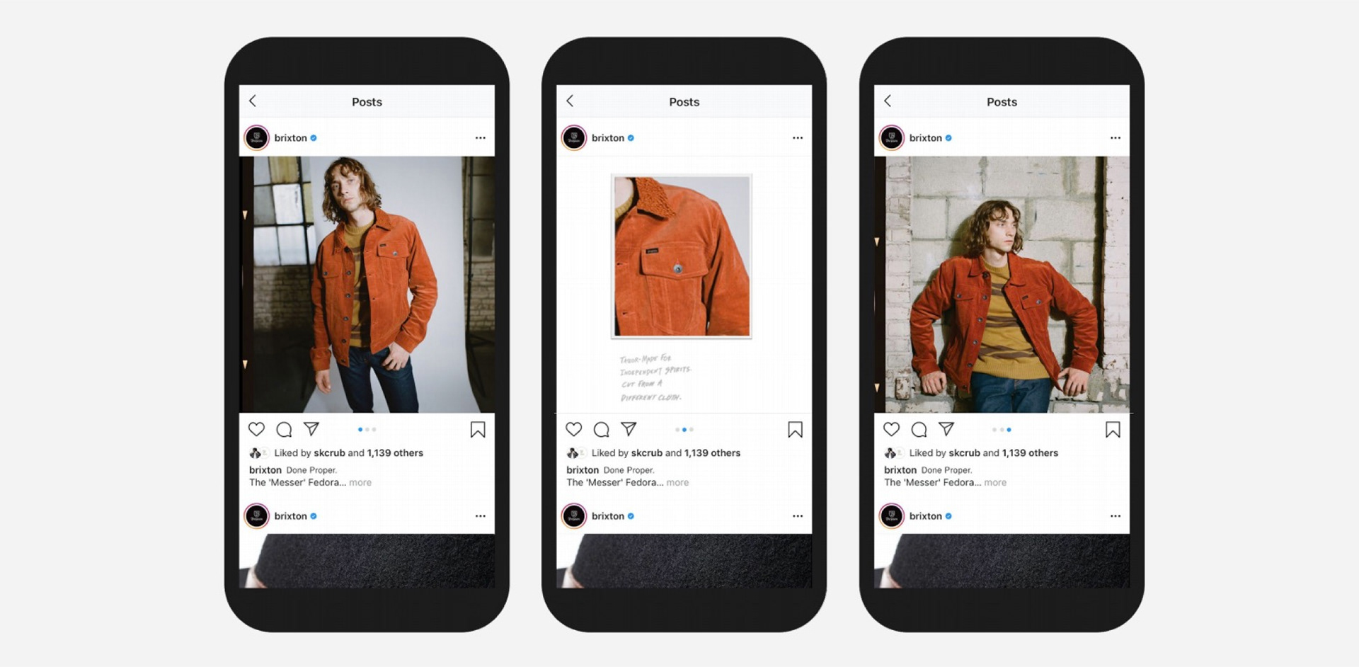
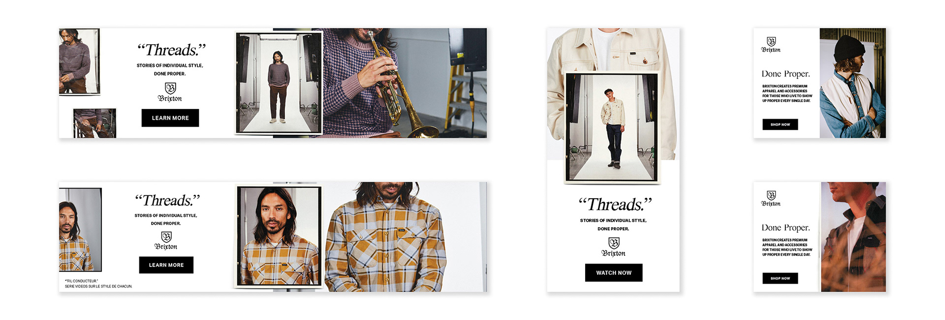
I was responsible for injecting the theme into all touch points across digital, including the website experience, organic and paid social, display advertising, as well as helping manage in-store and printed materials.
DIGITAL EXPERIENCES
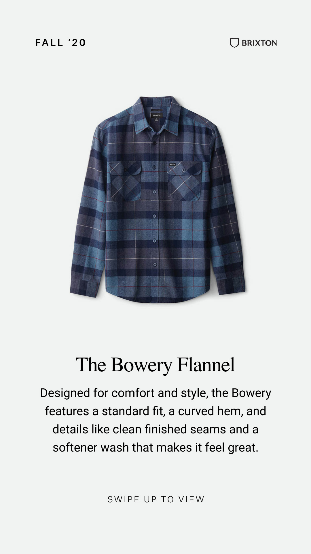
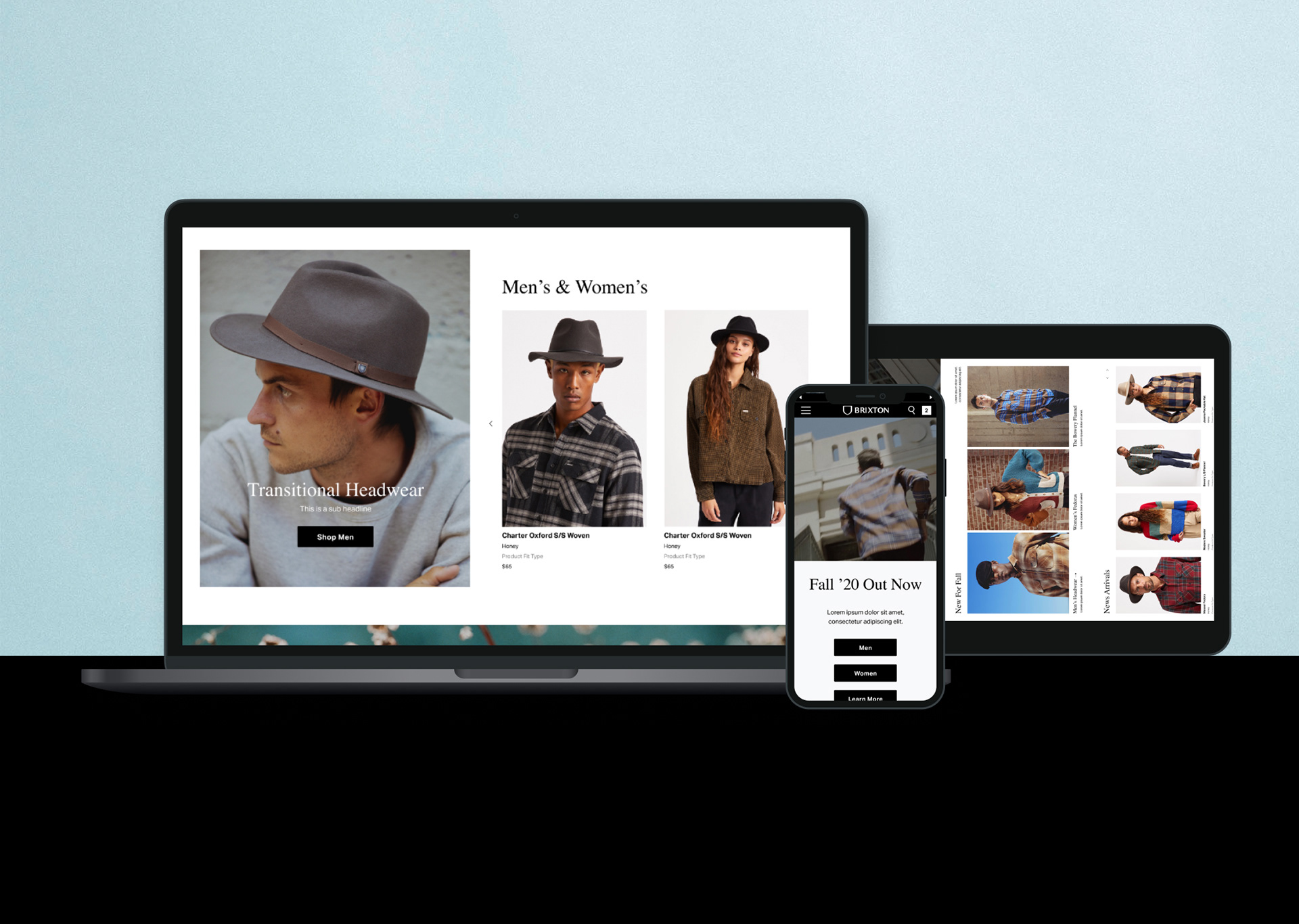
Custom PLPs
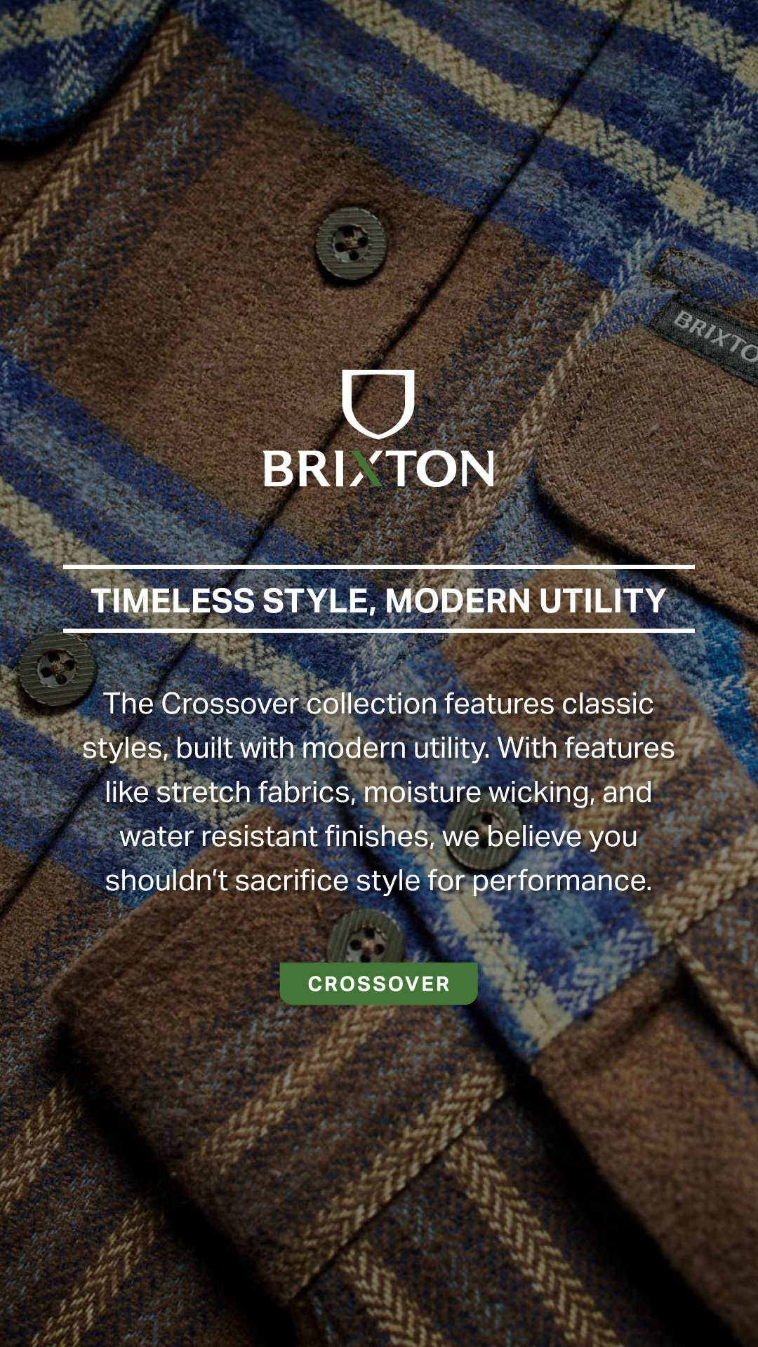
Brixton 2.0
The Next Step
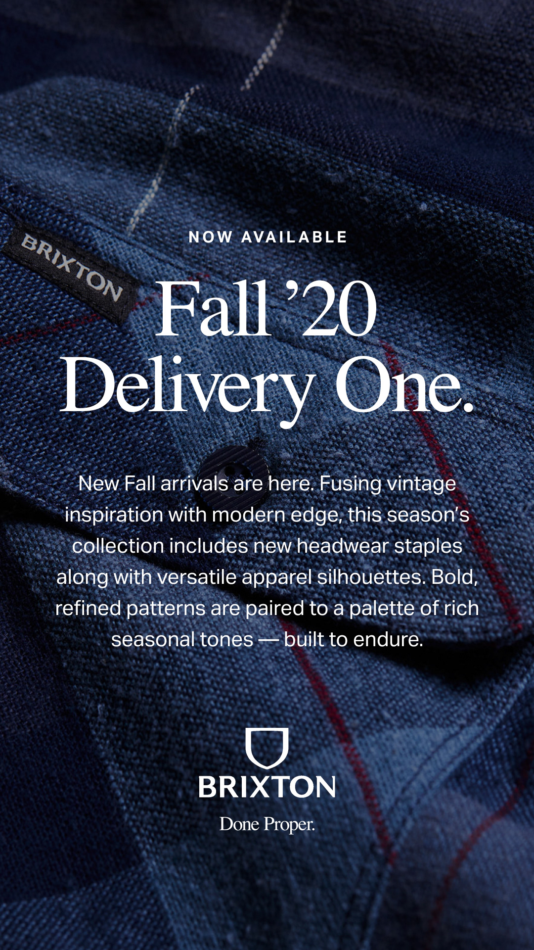
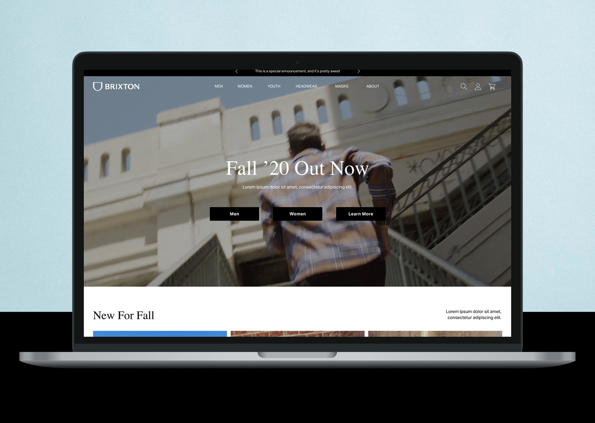
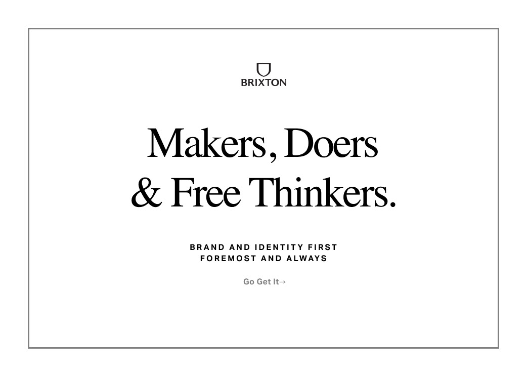
After that campaign had taken its course, we started the process of a complete rebrand, which included a new logo identity and a new course of action for marketing campaigns across photography, videography and digital applications.
Using learnings from the entire “Done Proper” experience, I realized that going into this replatform and redesign (with launch scheduled after the news of the Covid-19 pandemic) that we needed to simplify our site and advertising’s design components and functionality in order to make updates and experiences quicker and easier for our leaner internal team to manage. We all still liked the overall theme, but as the person in charge of getting all the collateral made, I pushed for us to pare down a little to let our photography and product shine, and most importantly make production of all these assets more realistic given our size.
Previous Homepage/ Global Styling
Updating Our Identity
Unifying The Design
We intended to stick to our “Done Proper” marketing campaign, featuring a new typography kit, updated photographic treatments and layouts, but never really executed this completely on our site due to a number of complications. We were up against it constantly on our last platform (I won't name names...) so getting development in this area was always put on the back burner.
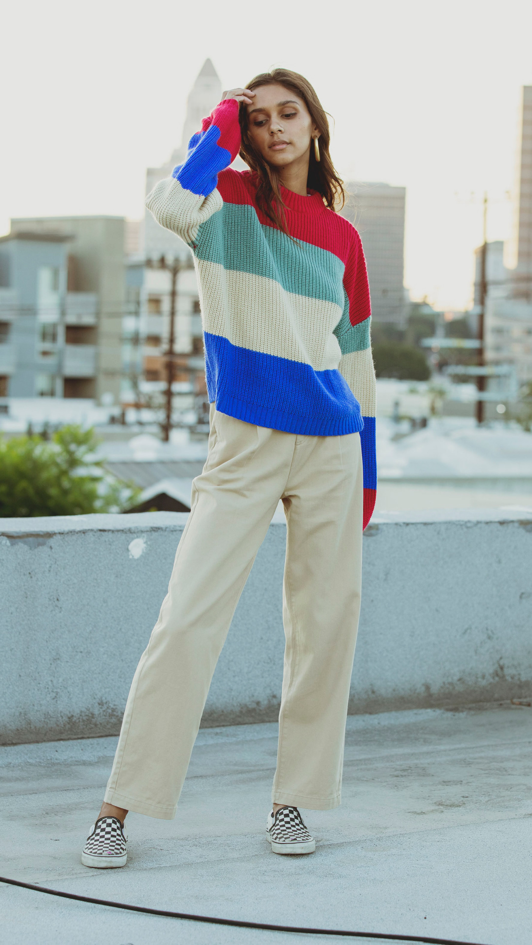
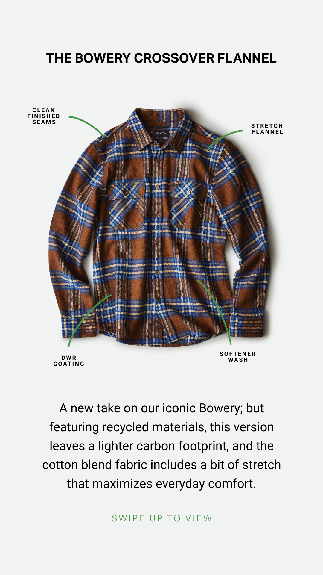
Now, with a chance to start fresh, we took advantage and built a site that checks off all the necessary boxes for having a successful ecommerce business, but I made sure it was a site a designer can be proud of.
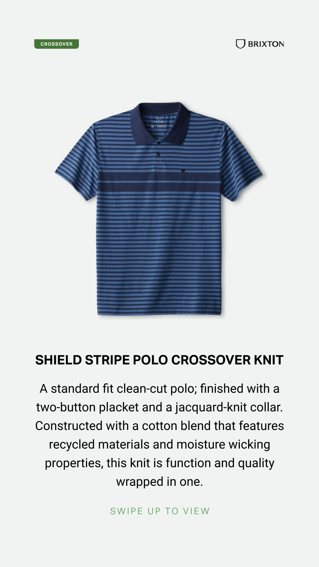
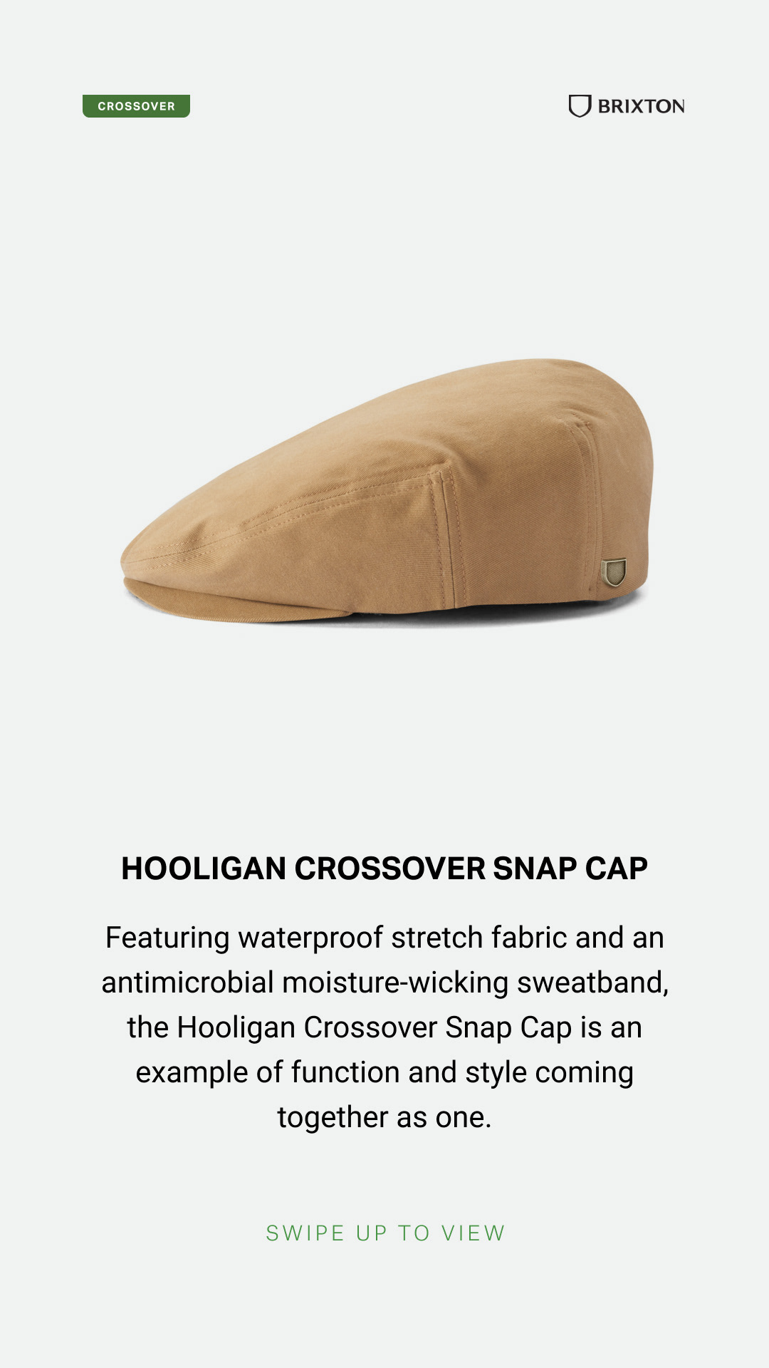
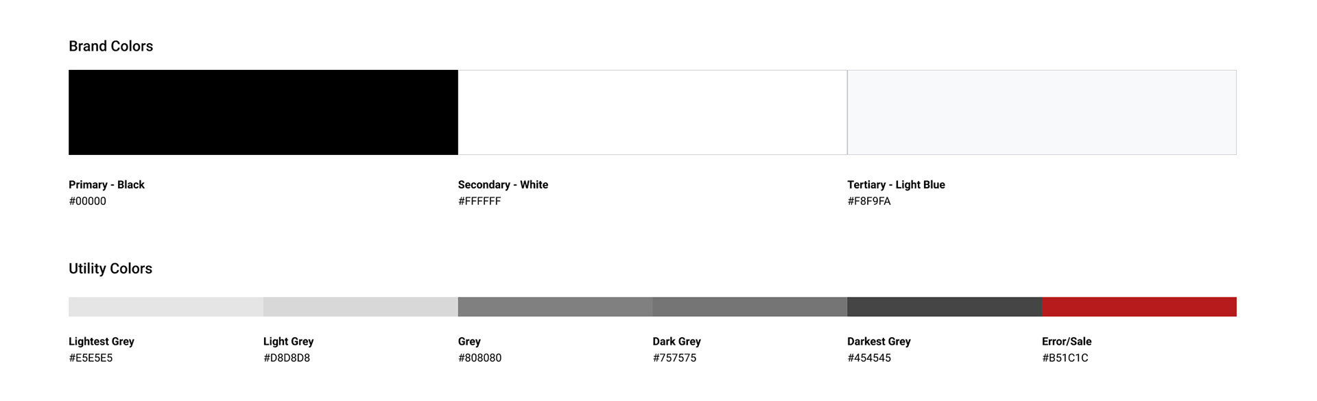
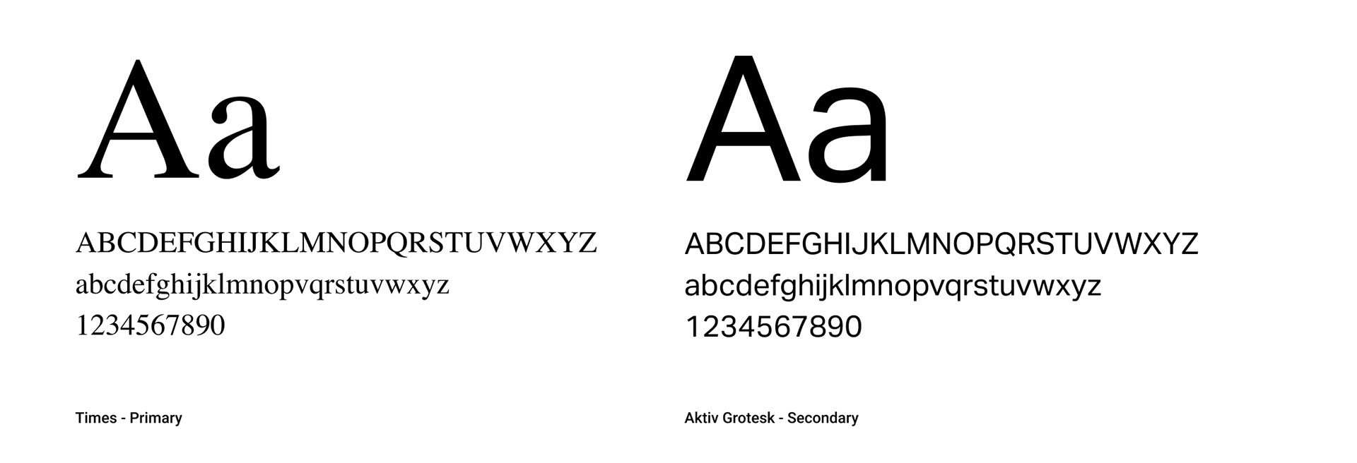
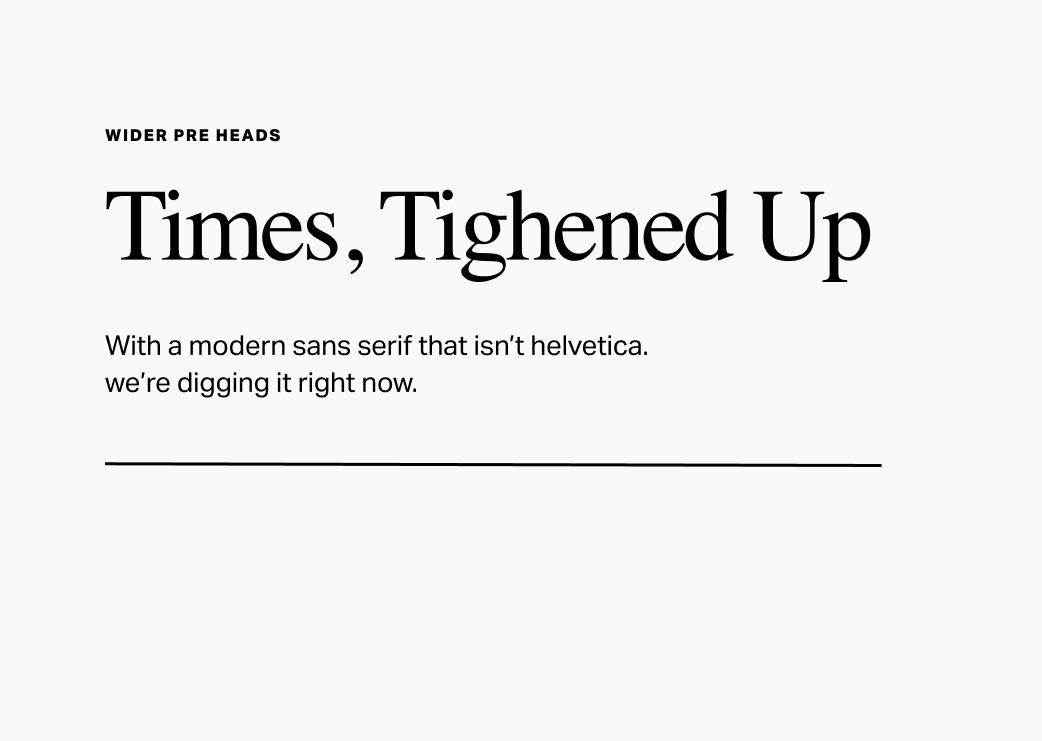
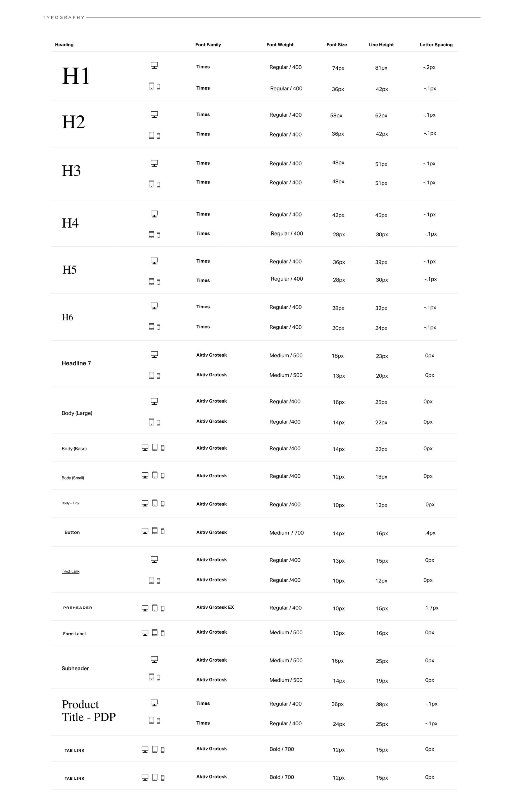
I mostly stuck with existing campaign colors, added some tonal variants, and paired them with our new layout that includes a heavy does of white space for that fashion magazine aesthetic. For typography, I incorporated our existing campaign fonts which includes Times with a tighter kerning for headlines (originally this was Scheherazade, which was essentially just Times with some spacing differences, I opted to go the web-safe route and just run Times), along with Aktiv Grotesk, which is a beautiful Swiss modern sans-serif that’s akin to Helvetica.
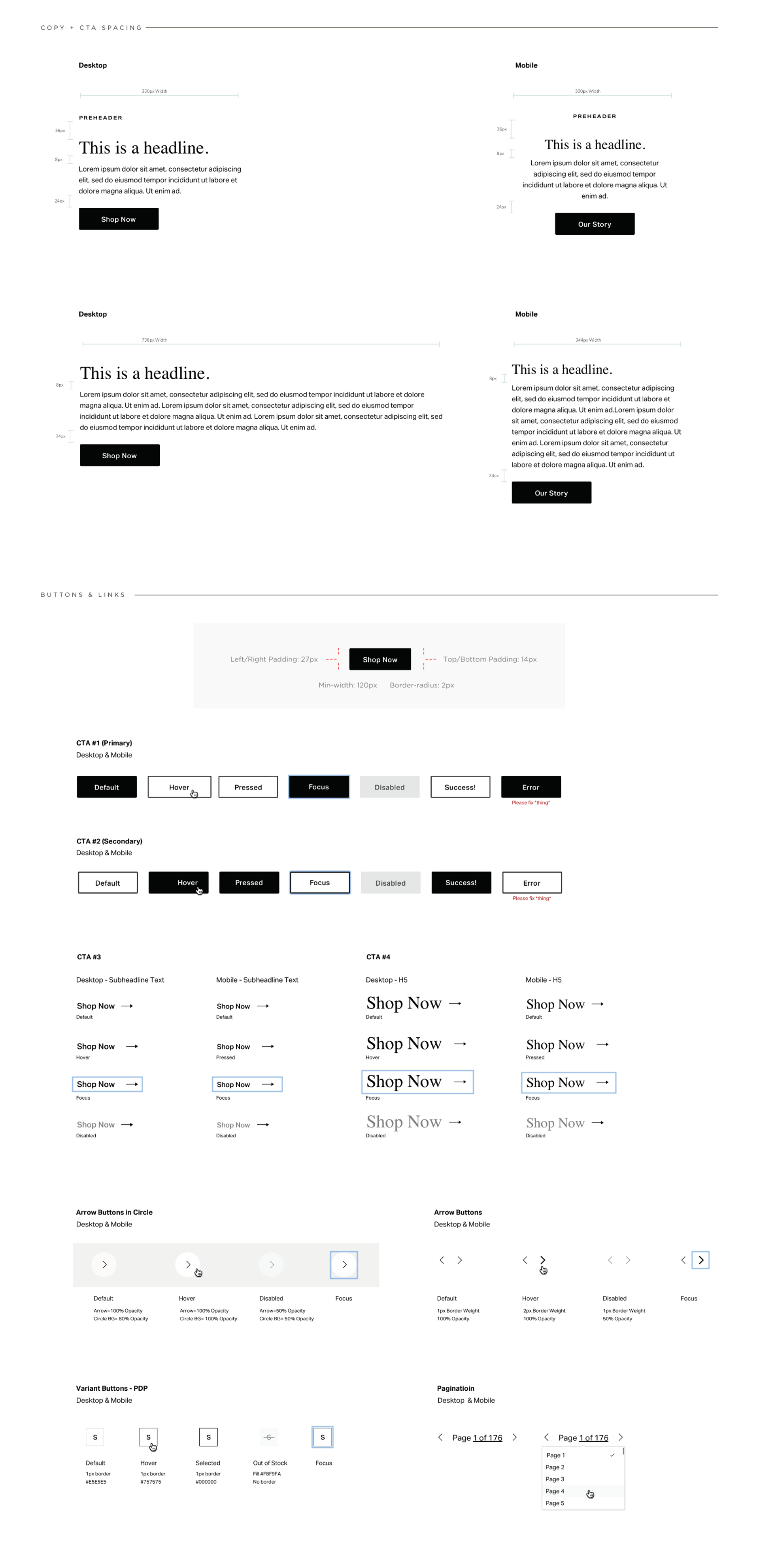
COLOR
TYPOGRAPHY
STYLE SHEET
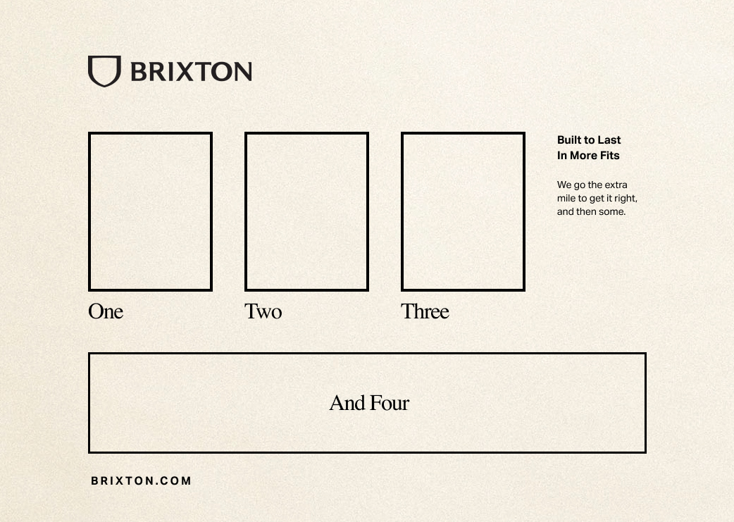
The Finished Products
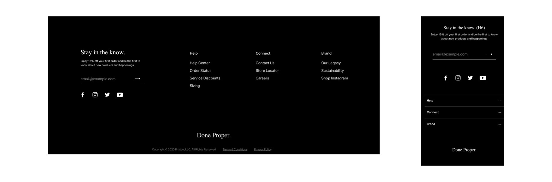
Global Application
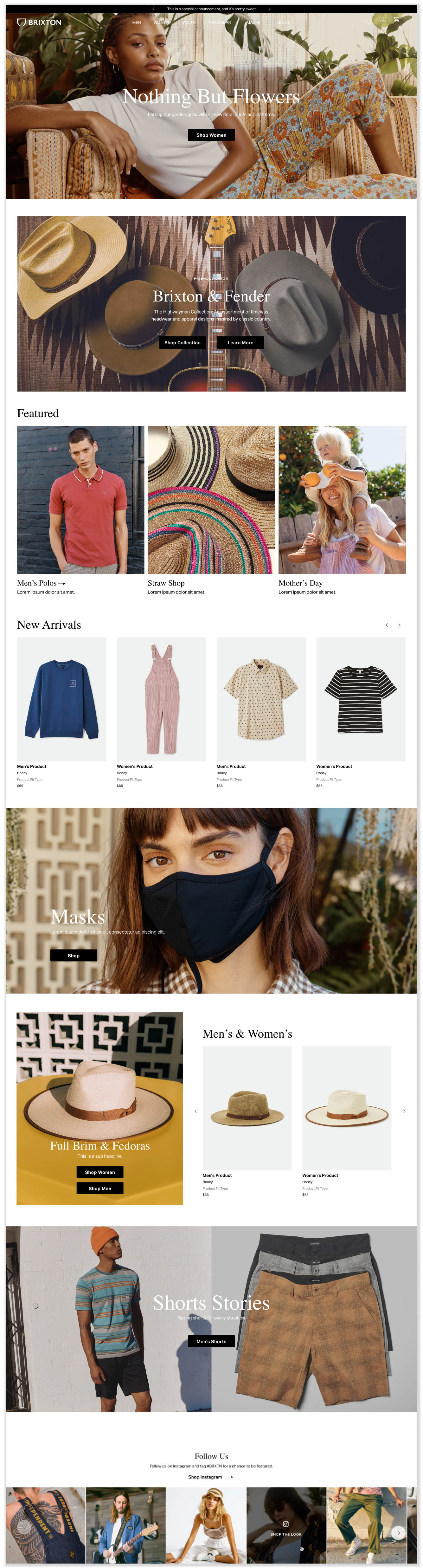
With all of the elements in place, we were able to utilize them across all elements of our new site, from the Homepage, to the PLP and collection pages, all the way down to the footer.
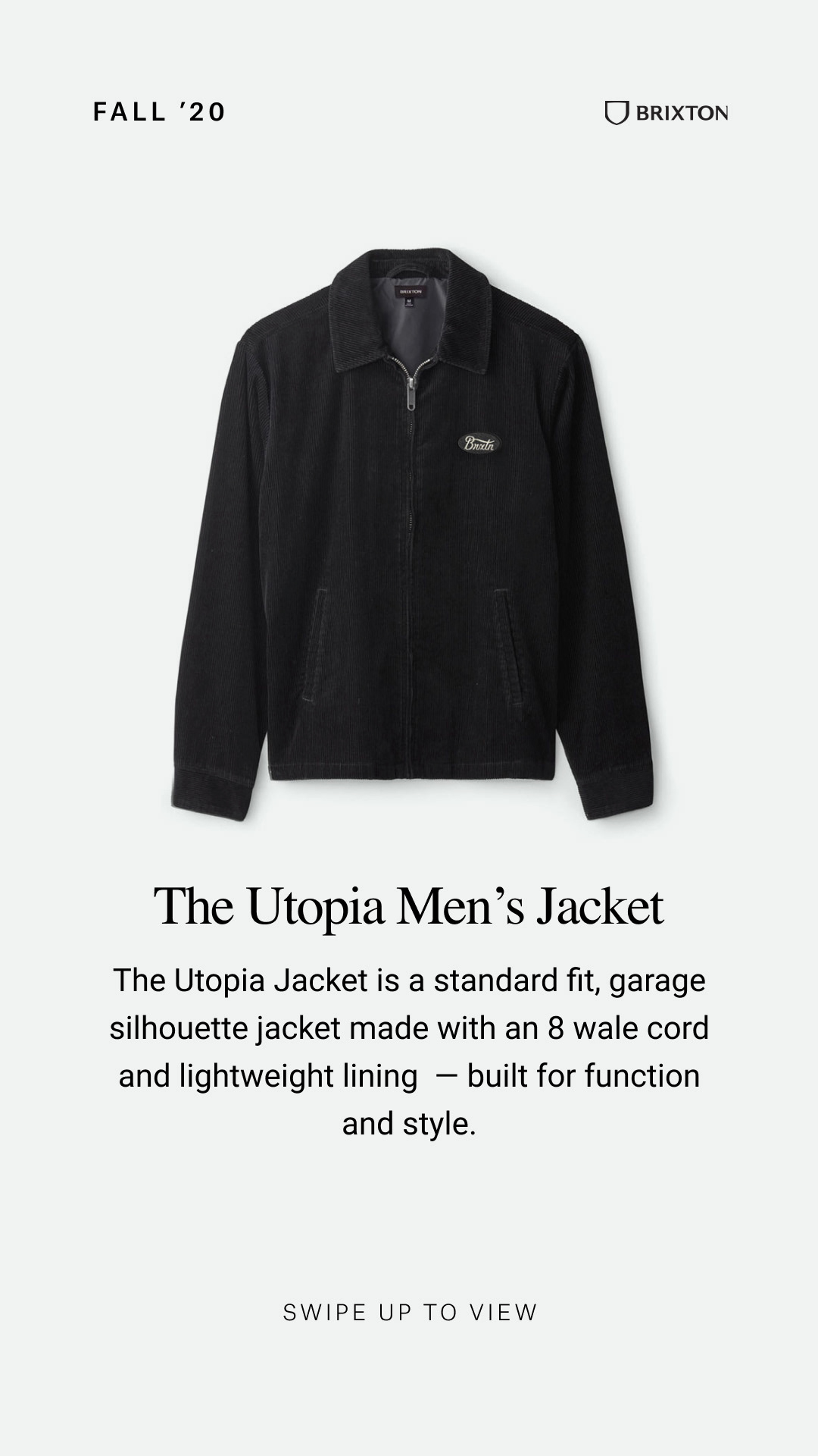
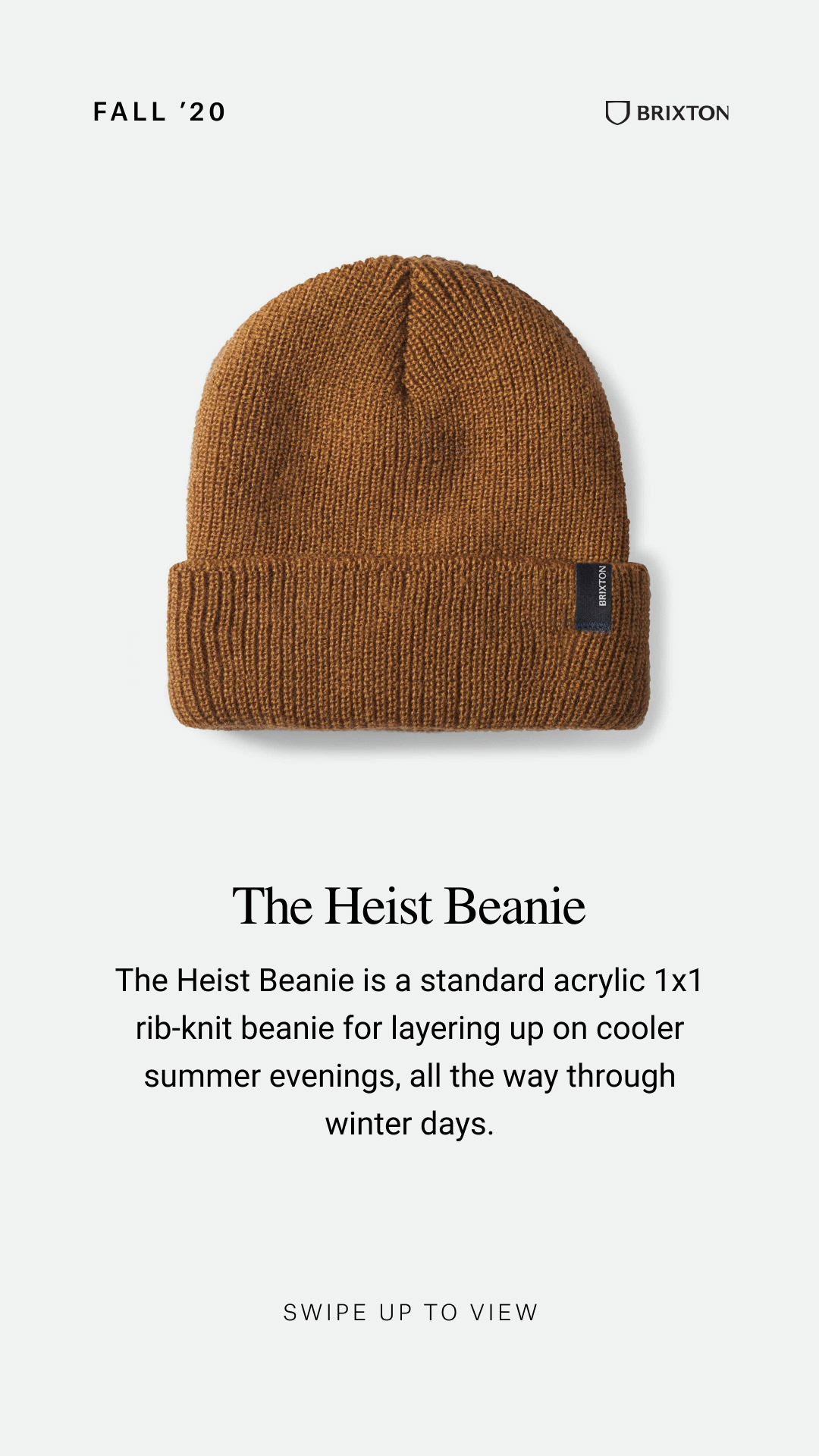
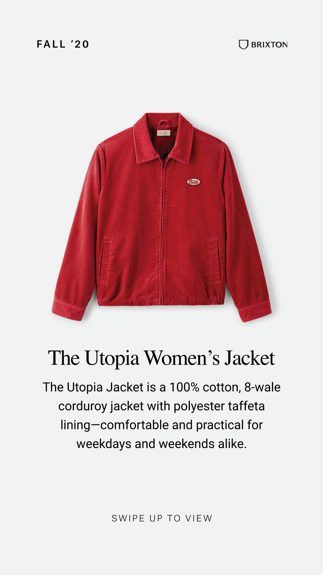
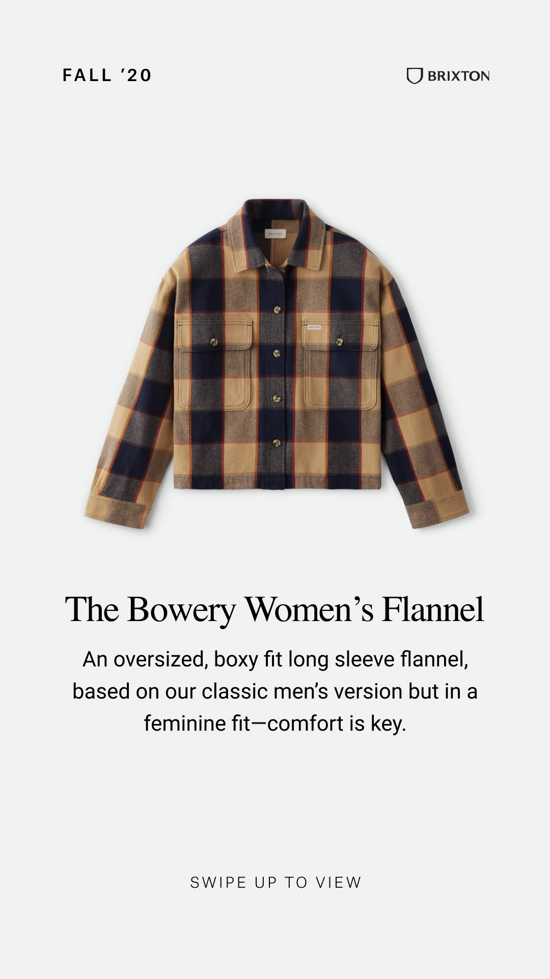
From there, I incorporated into one of our most important revenue-drivers, classic email marketing. I designed the template to include our new site experience and storytelling, and made it modular for all types of merchandising opportunities, from top to bottom funnel. We were also informed that the site's blog needed extra work and wouldn't be available for launch, so I made sure there were options to blend editorial-type stories into specific EDMs with larger stories that were often accompanied by a customized landing page experience.
The marketing team had evolved the scripting of our entire content calendar to be based on email marketing stories, so whenever we had a larger story to tell or GTM product push, I accompanied them with social media assets that followed the same lead.
So far so good. Sales are cranking and I'm very happy with just about everything we ship to our audience and partners. The next step is building upon these successes, and delving way deeper into the editorial side of our marketing. With such stiff competition in the DTC apparel market, this is how we’ll stand out for years to come.
ECOMMERCE
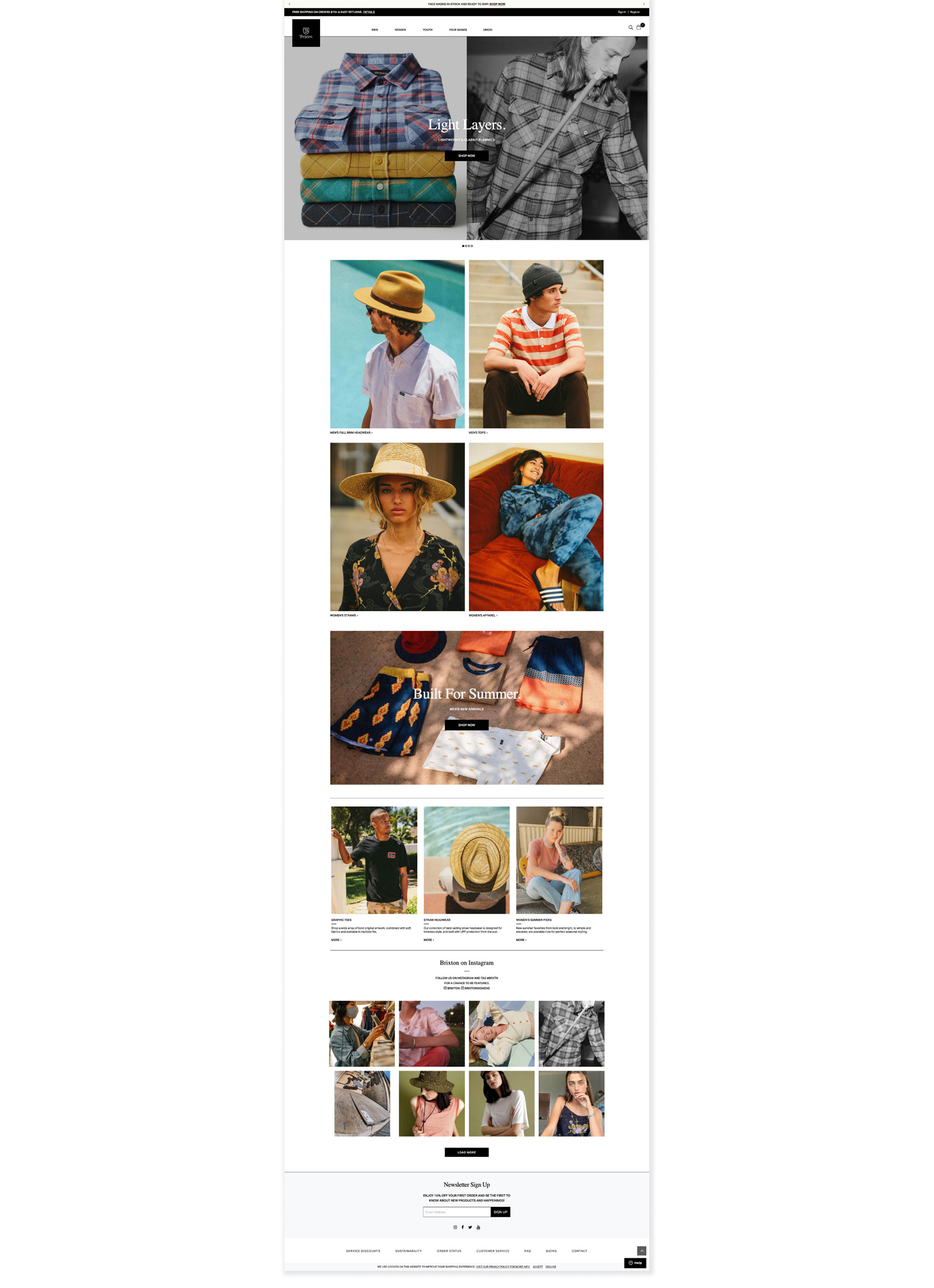
2.0 Homepage — Created with fully modular components.
Short and Long Form Custom PLPs
EDM
Main Template/Styling
Typical GTM and Product Focused Emails
Specialty Story and Collaboration
VIDEO ADVERTS

Storyboarding/Concepting to create ads from existing assets on the fly.
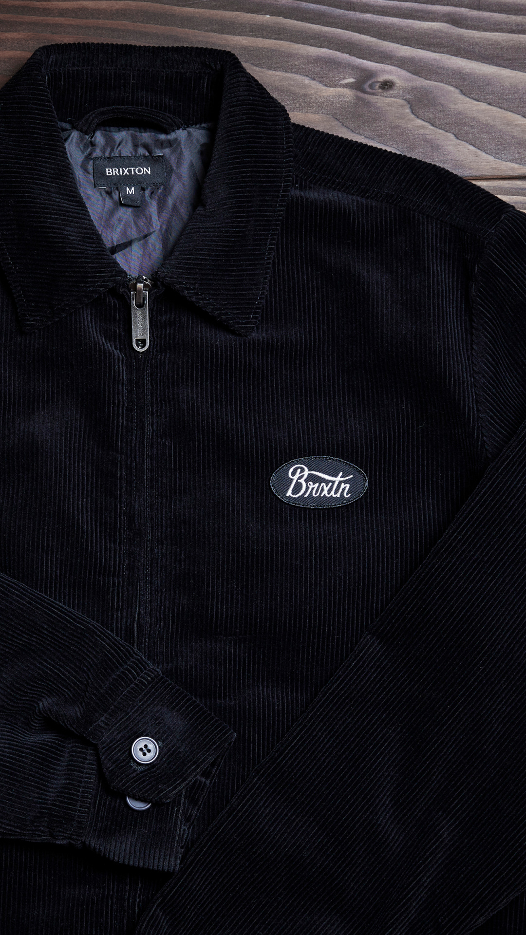
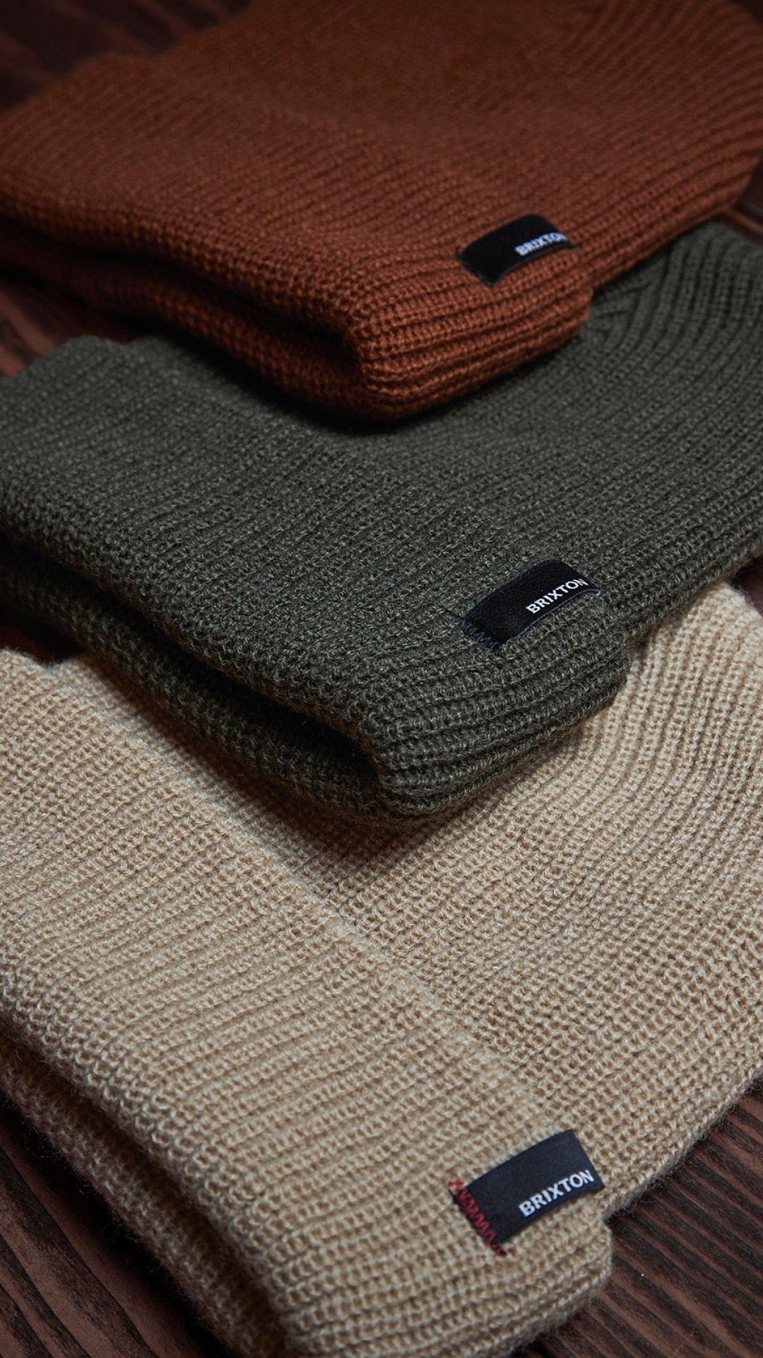
SOCIAL ASSETS